Jiren
Patti Mayonnaise
Hearts Bayformers
Posts: 35,163
|
Post by Jiren on May 19, 2018 4:57:52 GMT -5
Compared to her NXT shirt (which I own & wear often) that is awful.
Even if she didn't have that great NXT shirt that is still a terrible t-shirt
|
|
Deleted
Deleted Member
Posts: 0
|
Post by Deleted on May 19, 2018 5:31:27 GMT -5
No worse than that white Daniel Bryan shirt with nothing more than his name and a wrestling ring on the front. 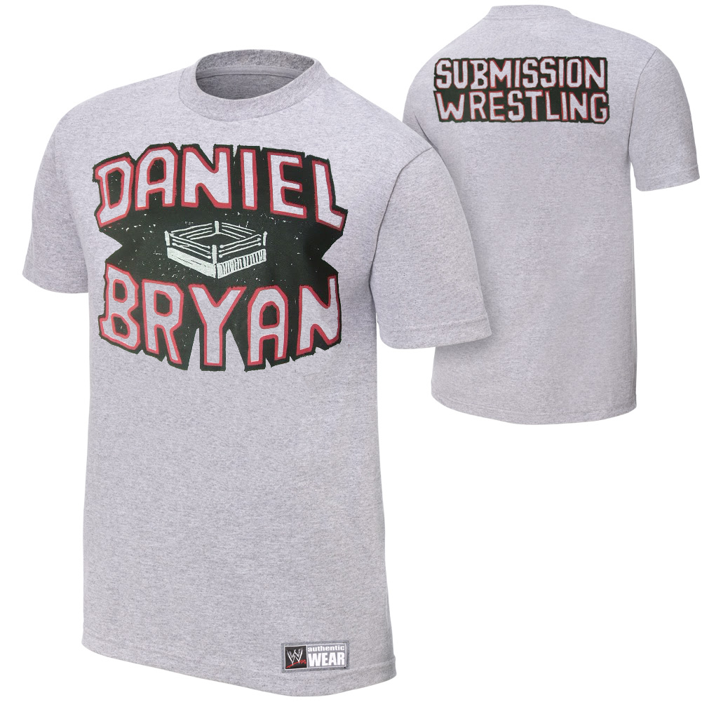 Hahaha, what the f***? |
|
Bad Moon
Unicron
for reasons known only to the goblins that live in my brain
Posts: 3,091 
|
Post by Bad Moon on May 19, 2018 6:36:56 GMT -5
That's just the Dark Souls logo.
|
|
|
|
Post by thetower52 on May 19, 2018 17:19:44 GMT -5
No worse than that white Daniel Bryan shirt with nothing more than his name and a wrestling ring on the front. Hahaha, what the f***? I own that shirt and I like it |
|
Pushed to the Moon
Bill S. Preston, Esq.
Tony Schiavone in Disguise
Working myself into a shoot
Posts: 15,819
|
Post by Pushed to the Moon on May 19, 2018 18:44:56 GMT -5
Someone really earned their money knocking that up in clipart. The underline is a classic thing you'd do in Word just for the sake of it.
|
|
mybraveface
ALF
On balance, off balance, doesn't even matter, 'cause I'm better than you are, yeah!"
Posts: 1,200
|
Post by mybraveface on May 20, 2018 8:42:21 GMT -5
No worse than that white Daniel Bryan shirt with nothing more than his name and a wrestling ring on the front. Hahaha, what the f***? And "submission wrestling" on the back. Ha. Always thought it was a very odd and generic t-shirt design and that it may have been a rib on him. If other fans liked it, cool, but I didn't. |
|
|
|
Post by Alice Syndrome on May 20, 2018 9:22:50 GMT -5
You've all seen my Fireworks MX art in the Raw threads right?
What I'm saying is I literally could have done better myself.
|
|
|
|
Post by Alice Syndrome on May 20, 2018 9:24:37 GMT -5
I wonder if they'd be better off trying to do like UFC does (did?) and just use a base template for everyone, and vary up the names, logos and colours based on the individual wrestler. The UFC example... 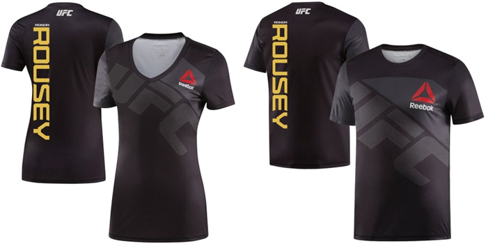 Complete with spelling errors and international incidents, I hope. |
|
|
|
Post by EoE: Well There's Your Problem on May 20, 2018 9:38:23 GMT -5
I wonder if they'd be better off trying to do like UFC does (did?) and just use a base template for everyone, and vary up the names, logos and colours based on the individual wrestler. The UFC example... Complete with spelling errors and international incidents, I hope. Wait, what happened? Someone get labelled under the wrong nationality or something? |
|
Mr T L Wolf
Hank Scorpio
He has the looks of Andre the Giant, and the strength of Barry Windham. Not to mention he's a hero to a few armadillos, a kangaroo and a small herd of bison.
Posts: 5,319
|
Post by Mr T L Wolf on May 20, 2018 9:41:50 GMT -5
|
|
|
|
Post by SparkyPlugg on May 20, 2018 10:24:16 GMT -5
I must be missing something, it looks good to me. Although I’d have preferred it without the underline on the text.
|
|
|
|
Post by Mighty Attack Tribble on May 20, 2018 10:43:05 GMT -5
I must be missing something, it looks good to me. Although I’d have preferred it without the underline on the text. It's not bad, per se. It's just incredibly uninspired and not something the average fan would expect to pay $30 including shipping for. I was able to make a close approximation of the design in a basic imaging program in less than five minutes, so I can't imagine that whoever was working in WWE's merchandising department spent that much more time on it. |
|
|
|
Post by Alice Syndrome on May 20, 2018 10:43:17 GMT -5
|
|
|
|
Post by Kevin Hamilton on May 20, 2018 10:45:42 GMT -5
I hope dawn of the eclipse isn't trying to be a catchphrase or anything, cuz f*** that's stupid.
|
|
|
|
Post by sdoyle7798 on May 20, 2018 11:54:34 GMT -5
Creative Services Manager: "Hey guys, my kid's a big Ember Moon fan, and he watched a few YouTube video's on using Illustrator. So, here's our new Ember Moon shirt."
|
|
|
|
Post by "Gizzark" Mike Wronglevenay on May 20, 2018 17:59:31 GMT -5
That looks like one of those shitty shirts when you buy the big deluxe package pre-order of a Triple-A video game. It reminds me of the Valve one I got with the Silver Box.
|
|
Perfect Timing
Dennis Stamp
Sigs/Avatars cannot exceed 1MB
Posts: 4,869
|
Post by Perfect Timing on May 20, 2018 18:29:01 GMT -5
Lots of terrible wrestling shirts over the years so no real surprise. It can't be any worse than what this little indy darling had.  |
|
|
|
Post by A Platypus Rave on May 20, 2018 19:03:03 GMT -5
Wait, what happened? Someone get labelled under the wrong nationality or something? Along with general RDV level hilarious misspellings, there's this one: Yeah... putting the Austrian Eagle on a Polish kit ... uh... comes off as kinda pro-Nazi. I mean I am not saying that's what they were going for but still... 2 seconds of googling Polish Flag. |
|
Deleted
Deleted Member
Posts: 0
|
Post by Deleted on May 20, 2018 19:03:18 GMT -5
 Can’t tell who this is for. 🙄 |
|
|
|
Post by DJ Maniak on May 20, 2018 19:22:26 GMT -5
Can’t tell who this is for. 🙄 Easy. Joey Joe Joe Junior Shabadoo. |
|