|
|
Post by AwamoriRock on Mar 6, 2019 7:30:18 GMT -5
In case you missed it, NOAH has some new ownership, and they've openly stated that part of their strategy in building the company back up is to move forward and go for a "new beginning", and this means moving away from Misawa by retiring the emerald green mat (outside of special occasions), getting new theme music and a new logo. (The same theme is kinda present in the storyline as well, with the younger generation of wrestlers torn between honoring legacy for a while before finally declaring that they want to step out from Misawa's shadow and create their own legacy).
That aside--what do you think of the new look? I think it looks a bit W-1 ish but someone on Twitter brought up that it looks like a Japanese porn service I think. I'm not exactly hot about the logo but they at least put out a really cool poster.
|
|
Convoy
El Dandy
Rusev admits to being a sex addict to large applause.
Posts: 7,522
|
Post by Convoy on Mar 6, 2019 8:13:06 GMT -5
I saw this last night and... meh. My immediate thought was also that the logo looked very W-1 or Zero1. Maybe a different green would’ve been wise to keep in place of the red.
I get going for a new, clean look in the new regime to try and build something different going forward. Not a fan of removing the emerald mat, but I barely watched NOAH over the last decade (basically since Misawa’s passing), so my viewership can only go up at this point.
|
|
|
|
Post by Clash, Never a Meter Maid on Mar 6, 2019 8:24:56 GMT -5
I don't like it. It looks bland as hell. The old typeface had attitude and passion to it.
|
|
Deleted
Deleted Member
Posts: 0
|
Post by Deleted on Mar 6, 2019 8:29:18 GMT -5
It's okay, but looks like a concept placeholder, no development.
|
|
|
|
Post by KAMALARAMBO: BOOMSHAKALAKA!!! on Mar 6, 2019 8:29:42 GMT -5
How kind of the designer to take a minute on MS Word to put this together.
|
|
Deleted
Deleted Member
Posts: 0
|
Post by Deleted on Mar 6, 2019 8:55:10 GMT -5
I don't know why this car logo has "Pro Wrestling" written on it.
|
|
chrom
Backup Wench
Master of the rare undecuple post
Posts: 84,718 
|
Post by chrom on Mar 6, 2019 8:58:17 GMT -5
No sir, I don't like it
|
|
Deleted
Deleted Member
Posts: 0
|
Post by Deleted on Mar 6, 2019 10:27:49 GMT -5
I really like it, it's clean and simple. It's the exact opposite of the "EXTREME MOUNTAIN DEW11!!!" style logos of modern American wrestling companies.
|
|
Deleted
Deleted Member
Posts: 0
|
Post by Deleted on Mar 6, 2019 10:35:55 GMT -5
|
|
Fundertaker
El Dandy
Hideo Kojima should direct every ending ever!
Posts: 8,927
Member is Online
|
Post by Fundertaker on Mar 6, 2019 11:22:56 GMT -5
I don't know why this car logo has "Pro Wrestling" written on it. Yeah that's kinda the problem I have with it. It seems clearly made for something that's not wrestling. It's not memorable like a good logo should be. I don't want it to be WordArttsy or anything but either give us some designs or more color to make an impression. For comparison, here's some of the other Japanese promotions logos: ZERO1  WRESTLE-1 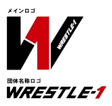 New Japan 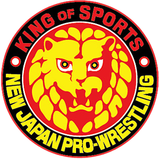 All Japan 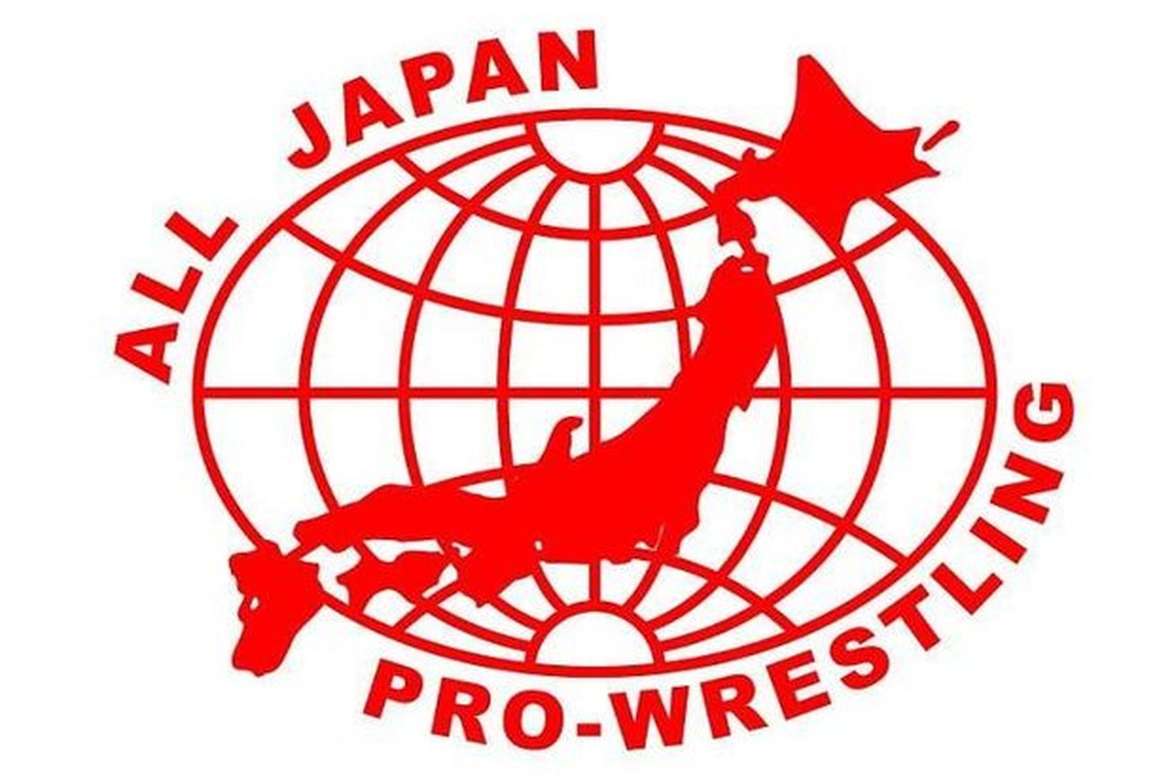 Big Japan  FREEDOMS  BASARA  So, no matter what level, everyone has something that stands out of their logo. NOAH has... nothing now. |
|
Deleted
Deleted Member
Posts: 0
|
Post by Deleted on Mar 6, 2019 11:24:57 GMT -5
the logo and mat color were the least of their problems
|
|
Deleted
Deleted Member
Posts: 0
|
Post by Deleted on Mar 6, 2019 11:25:32 GMT -5
Pretty weak, but at least they managed to work a squared circle in there.
|
|
Deleted
Deleted Member
Posts: 0
|
Post by Deleted on Mar 6, 2019 11:38:59 GMT -5
|
|
Glitch
King Koopa
Not Going To Die; Childs, we're goin' out to give Blair the test. If he tries to make it back here and we're not with him... burn him.
Watching you.
Posts: 12,716
|
Post by Glitch on Mar 6, 2019 15:13:00 GMT -5
Yes, it does look like a porn logo.  |
|
TGM
Hank Scorpio
Posts: 6,073
|
Post by TGM on Mar 6, 2019 15:50:34 GMT -5
I like it.
Does anybody remember last year when there were reports of WWE and NOAH partnering up? Or did I imagine this? I'd love to see NOAH content on the WWE Network.
|
|
|
|
Post by Clash, Never a Meter Maid on Mar 6, 2019 15:54:15 GMT -5
It really just reminds me of how gorgeous NJPW's lion logo looks.
|
|
Deleted
Deleted Member
Posts: 0
|
Post by Deleted on Mar 6, 2019 17:32:35 GMT -5
Swap out some animals for the original AJPW talent who came with Misawa. Or at least put their heads on the Walruseses. |
|
|
|
Post by YAKMAN is ICHIBAN on Mar 6, 2019 17:57:11 GMT -5
 Here's the old one. Can't say it is an upgrade. I like what it is going for, especially with the "squared circle", but it misses the mark. And here was their 15 year anniversary logo  |
|
bigbadbull
Don Corleone
Enter your message here...
Posts: 1,489
|
Post by bigbadbull on Mar 6, 2019 19:05:22 GMT -5
I like it. It doesn't have the Misawa look but this is a new direction and the use of the square on a circle is a pretty nice touch.
|
|
Mozenrath
FANatic
Foppery and Whim
Speedy Speed Boy
Posts: 121,080
Member is Online
|
Post by Mozenrath on Mar 6, 2019 19:28:49 GMT -5
Not a fan, but I get that they needed to move on. The stigma of Misawa's death has hung heavily on them, and they need to move forward.
|
|