|
|
Post by Captain Stud Muffin (BLM) on Jul 6, 2020 22:13:35 GMT -5
If I had any technological know how of how to link to it, I would, but WWE just posted a close-up picture of it to their Instagram account and it looks fantastic. Easily the best belt redesign they’ve undertaken since the Spinner WWE Championship was changed back in 2013.  https://www.instagram.com/p/CCUqgHxhmMj |
|
|
|
Post by Instant Classic on Jul 6, 2020 22:14:16 GMT -5
The old design lasted a very long time, I will miss it because it was one of my favorite designs. I like the new design way better than the new IC title. They should have made United States bigger than Champion though.
|
|
|
|
Post by Captain Stud Muffin (BLM) on Jul 6, 2020 22:14:34 GMT -5
I think it’s a massive improvement over the old belt. I have no issues with it really Yea, the old title was way outdated This looks good. It is diff from the other titles. People eventually warm up to titles anyway |
|
|
|
Post by brettappedout (BLM) on Jul 6, 2020 22:15:39 GMT -5
I actually like it. It has that old territory like look to it.
|
|
|
|
Post by Oh Cry Me a Screwball on Jul 6, 2020 22:16:24 GMT -5
If I had any technological know how of how to link to it, I would, but WWE just posted a close-up picture of it to their Instagram account and it looks fantastic. Easily the best belt redesign they’ve undertaken since the Spinner WWE Championship was changed back in 2013. https://www.instagram.com/p/CCUqgHxhmMj They really should post the titles online in these photoshoots where they can make the titles look as purdy as possible, as opposed to unveiling them in the ring being shot at really bad angles with lighting not meant to highlight the titles. The difference in first impressions goes a long way. That being said. |
|
Dub H
Crow T. Robot
Captain Pixel: the Game Master
I ❤ Aniki
Posts: 47,824
Member is Online
|
Post by Dub H on Jul 6, 2020 22:17:20 GMT -5
The design is interesting like...I like the diea,the execution seems a little off.
|
|
|
|
Post by Instant Classic on Jul 6, 2020 22:18:41 GMT -5
Such a shame that boring Apollo will be the first holder.
|
|
Xxcjb01xX [PIECE OF: SH-]
FANatic
Writer, Lover of all things Wrestling. Analytical, Critical, Lovable (hopefully). Lets all have fun!
Posts: 234,824
|
Post by Xxcjb01xX [PIECE OF: SH-] on Jul 6, 2020 22:33:05 GMT -5
I for one, welcome our new Sin Cara Championship.
|
|
Xxcjb01xX [PIECE OF: SH-]
FANatic
Writer, Lover of all things Wrestling. Analytical, Critical, Lovable (hopefully). Lets all have fun!
Posts: 234,824
|
Post by Xxcjb01xX [PIECE OF: SH-] on Jul 6, 2020 22:35:11 GMT -5
I mean... technically, there's a winged Eagle on a WWE title now, like everyone had wanted  |
|
|
|
Post by arrogantmodel on Jul 7, 2020 0:08:37 GMT -5
"Champion" looks black, not blue. It needs some royal blue.
And yeah, the U.S. title means jack shit anyways. Who cares what it looks like? 😒
|
|
King Devitt
Grimlock
It gets better the longer you stare at it
Posts: 13,721
|
Post by King Devitt on Jul 7, 2020 0:15:44 GMT -5
The design is interesting like...I like the diea,the execution seems a little off. Yeah, the issue for me is the design is just a lack of imagination. It looks very...basic. and blocky. I don't hate it, but I'm not a fan of it either. It's better than the IC title, but honestly that's not saying much. |
|
|
|
Post by Starshine on Jul 7, 2020 0:27:20 GMT -5
They really should post the titles online in these photoshoots where they can make the titles look as purdy as possible, as opposed to unveiling them in the ring being shot at really bad angles with lighting not meant to highlight the titles. The difference in first impressions goes a long way. That being said. At this rate, maybe it should be renamed to the Sigmund Freudian Championship. |
|
|
|
Post by DSR on Jul 7, 2020 0:43:32 GMT -5
Such a shame that boring Apollo will be the first holder.  |
|
|
|
Post by 1 Free Moon-Down with Burger on Jul 7, 2020 0:44:46 GMT -5
After the TNT title, this thing is beautiful!
|
|
|
|
Post by Eddie Brock on Jul 7, 2020 0:45:29 GMT -5
I like it. The eagle gives me old school vibes. The only thing I'd add is blue around the stars. The white stars get lost with the gold surroundings. 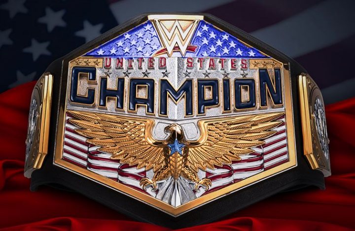 I think some color on the stars helps JUST LIKE THIS! |
|
|
|
Post by 111111 on Jul 7, 2020 3:54:56 GMT -5
What an ugly belt with an ugly font...
|
|
Deleted
Deleted Member
Posts: 0
|
Post by Deleted on Jul 7, 2020 4:03:22 GMT -5
I like it. That's The Apollo Answer to John Cena's spinning shit.
|
|
|
|
Post by David-Arquette was in WCW 2000 on Jul 7, 2020 4:57:05 GMT -5
Looks fantastic to be fair. Maybe would adjust the size of the lettering a bit, 'United States' bigger maybe, flatten down 'Champion' a bit. Other than that it's great. Reminiscent of territory dsys, but with a modern twist, and not obnoxiously gaudy.
|
|
|
|
Post by Can you afford to pay me, Gah on Jul 7, 2020 5:30:13 GMT -5
I like it. The eagle gives me old school vibes. The only thing I'd add is blue around the stars. The white stars get lost with the gold surroundings. I think some color on the stars helps JUST LIKE THIS! I knew something was missing but I couldn't put my figure on it. This was it. |
|
|
|
Post by 111111 on Jul 7, 2020 6:44:34 GMT -5
Looking at this for a second time why does everything the WWE designs nowadays have a “blocky” look and feel to it?
|
|


![Xxcjb01xX [PIECE OF: SH-] Avatar](http://storage.proboards.com/3411247/avatar/SAmefOpXbCxSOR0DUtvP.jpg)