|
|
Post by HMARK Center on May 19, 2022 14:11:00 GMT -5
Just had this thought while scrolling through MLB Extra Innings: I'm checking in on the Padres/Phillies game, and the Phillies are wearing their retro powder blue and maroon jerseys and while they certainly look a bit dated, I think they're a lot better than their normal home red pinstripe jerseys. Heck, beyond that I'd say their home cream-white alternates with no pinstripes are better than their normal jerseys. If I were their owner I'd consider switching full time.
I'll pick another team I dislike to make my argument: the New York Rangers typically wear royal blue as their base home jersey, but I thought their dark blue alternates looked better on them. Contrast this with the rival Islanders, who wore dark blue home jerseys for a few years and just looked awful; they're much, much better going back to their classic royal blues. But for whatever reason I think the darker blue just works better for the Rangers. Probably because it goes better with the red on their jerseys as opposed to the orange on the Islanders', and because games at Madison Square Garden already always look so dark on TV, anyway, so why not lean into it?
Any other ideas out there? I'd share some pictures for comparison's sake but I'm too lazy at the moment.
|
|
|
|
Post by DiBiase is Good on May 19, 2022 14:16:27 GMT -5
As iconic as the red shirts are, I’ve always preferred Liverpool’s away shirts. There’s only so much you can do with all red, the away kits have been every colour of the rainbow with some outlandish designs and when they get it right, it’s beautiful.
|
|
Push R Truth
Patti Mayonnaise
Unique and Special Snowflake, and a pants-less heathen.
Perpetually Constipated
Posts: 39,372
|
Post by Push R Truth on May 19, 2022 14:18:34 GMT -5
The striped uniforms from the World Series Twins Era were the PEAK of Twins Uniforms and it's a crime they wear anything else.  Even though I say that, I do have to admit their uniform game has been on point for ages. I can really only think of like 2 uniforms I really disliked of theirs. It's just the old stripes were so classy. |
|
|
|
Post by Jedi-El of Tomorrow on May 19, 2022 17:45:58 GMT -5
The Tampa Bay Rays fauxbacks are the shit.
The Marlins pinstripes and their teal ones. Those should be the current uniforms.
|
|
|
|
Post by HMARK Center on May 19, 2022 20:12:31 GMT -5
The Tampa Bay Rays fauxbacks are the shit. The Marlins pinstripes and their teal ones. Those should be the current uniforms. Sidenote: I'd love for the Marlins to go back to teal full time and the DBacks to get back to purple and turquoise. They're two teams who are products of the 90s, by God they should look like it. That, and the original DBack uniforms were just so much truer to the cultural history of Arizona...plus the current ones are just bleh, all 9,000 variations of it. |
|
|
|
Post by The Captain on May 20, 2022 0:44:14 GMT -5
I like the various retro jerseys the Nets wear. The regular black and white ones are so boring.
|
|
tirtefaa
Unicron
If you wanna know the truth, you gotta dig up Johnny Booth.
Posts: 3,374
|
Post by tirtefaa on May 20, 2022 1:13:22 GMT -5
Sidenote: I'd love for the Marlins to go back to teal full time and the DBacks to get back to purple and turquoise. The Marlins should definitely go back to the aquamarine colors, as that color scheme was exclusive to them. I don't mind the Diamondbacks staying the same as several teams use purple, and admittedly the earth red looks pretty cool. That being said, the Rays should definitely go back to being the Devil Rays, that was an awesome logo. Not a White Sox fan, but I may actually cheer them if they went back to these uniforms.  |
|
|
|
Post by HMARK Center on May 20, 2022 12:42:55 GMT -5
I like the various retro jerseys the Nets wear. The regular black and white ones are so boring. Seriously, these are great: 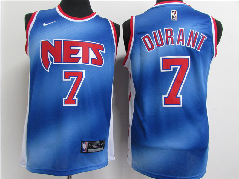 The black and white look was a weird "we're going to BROOKLYN, and we gotta look HARD" thing. I never really liked the Nets jerseys during their glory days in New Jersey, but the bright blues are just slick. Looking around baseball, I see it's a slightly mixed bag so far on those new City Connect jerseys each team is getting. Not sure any of them are straight up better than the regular jerseys their teams use, but there's a couple that are at least close: 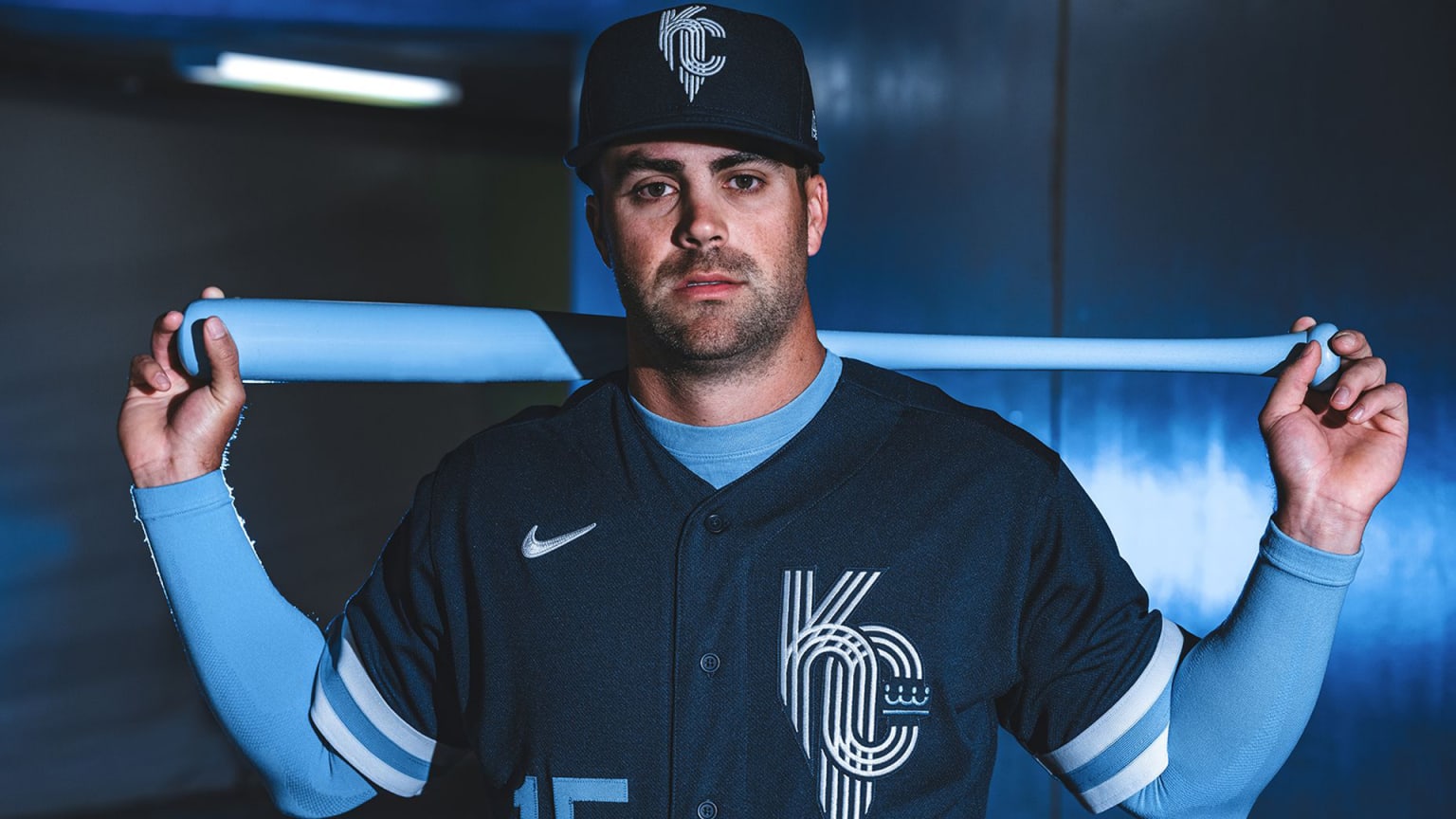 |
|
|
|
Post by Vice honcho room temperature on May 20, 2022 19:22:59 GMT -5
I like the various retro jerseys the Nets wear. The regular black and white ones are so boring. Seriously, these are great:  The black and white look was a weird "we're going to BROOKLYN, and we gotta look HARD" thing. I never really liked the Nets jerseys during their glory days in New Jersey, but the bright blues are just slick. Reminds me how boring the Devil's "Jersey jersey" is. I remember an ex girlfriend trying to recontact me on Super Bowl Sunday during that game and her remarking how she liked the jersey and me think "This is why I can't be friends with you" |
|
Nosnorb
El Dandy
Nachos and Fraggle Rock are TIMELESS.
Posts: 8,428
|
Post by Nosnorb on May 21, 2022 5:57:56 GMT -5
The Canes black sweaters with a gunmetal grey yoke and the Hurricane warning flag on a stick (with an outline of NC in the negative space) are much nicer than the home sweaters.
|
|
|
|
Post by HMARK Center on May 21, 2022 6:40:39 GMT -5
Seriously, these are great:  The black and white look was a weird "we're going to BROOKLYN, and we gotta look HARD" thing. I never really liked the Nets jerseys during their glory days in New Jersey, but the bright blues are just slick. Reminds me how boring the Devil's "Jersey jersey" is. I remember an ex girlfriend trying to recontact me on Super Bowl Sunday during that game and her remarking how she liked the jersey and me think "This is why I can't be friends with you" I have to admit: the new black jerseys for the Devils 100% grew on me during the season. They just pop so well against the ice surface and look great on TV, to me. And I really don't mind a minimalist look, overall. Helps that black's been part of the Devils' color scheme for so long, so it doesn't feel as much like a gimmick, but I increasingly dug them as the year went on, despite the whole "a jersey that says Jersey" thing (points for them making the hats that say "Hat" to go with them).  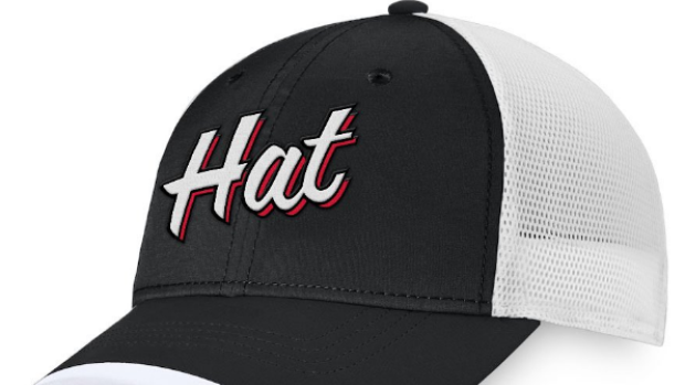 Gotta say, though, I'm bummed as hell that the Reverse Retro the Devils used last year, with the green base, isn't widely available anymore, that thing was nice. |
|
|
|
Post by The Lach is very tired on May 21, 2022 7:21:16 GMT -5
As iconic as the red shirts are, I’ve always preferred Liverpool’s away shirts. There’s only so much you can do with all red, the away kits have been every colour of the rainbow with some outlandish designs and when they get it right, it’s beautiful. Both of this season's are incredible. I especially love the marble one, helps that I will always think of 5-0 at Old Trafford when I see it. |
|
|
|
Post by karl100589 on May 21, 2022 7:31:28 GMT -5
Newcastle's 95/96 shirt is still regarded as the best by our fans. Not so much Keegan's suit mind you. |
|
|
|
Post by DiBiase is Good on May 21, 2022 8:52:11 GMT -5
Newcastle's 95/96 shirt is still regarded as the best by our fans. Not so much Keegan's suit mind you. Mid-90s Adidas kits are the pinnacle IMO. Those Newcastle kits were spectacular and us Liverpool fans got this :  |
|
|
|
Post by MrElijah on May 21, 2022 14:38:10 GMT -5
I like the various retro jerseys the Nets wear. The regular black and white ones are so boring. Seriously, these are great:  The black and white look was a weird "we're going to BROOKLYN, and we gotta look HARD" thing. I never really liked the Nets jerseys during their glory days in New Jersey, but the bright blues are just slick. Looking around baseball, I see it's a slightly mixed bag so far on those new City Connect jerseys each team is getting. Not sure any of them are straight up better than the regular jerseys their teams use, but there's a couple that are at least close:  Those Early 90s Nets Jerseys were so good. Heck, some Jerseys thst combine the best elements of past Jerseys work shown during the NBA 75th season. Staying strictly on Baseball, 80s/Early 90s had the best jerseys. The powder blues of KC, Philadelphia & The Cards ruled. The Mets '86 look is timeless and the Braves should've never stopped wearing their blue and whites. |
|
|
|
Post by thegatewaydrug on May 21, 2022 23:18:13 GMT -5
|
|
|
|
Post by thegatewaydrug on May 21, 2022 23:36:59 GMT -5
"Northwest Green" in 1995: 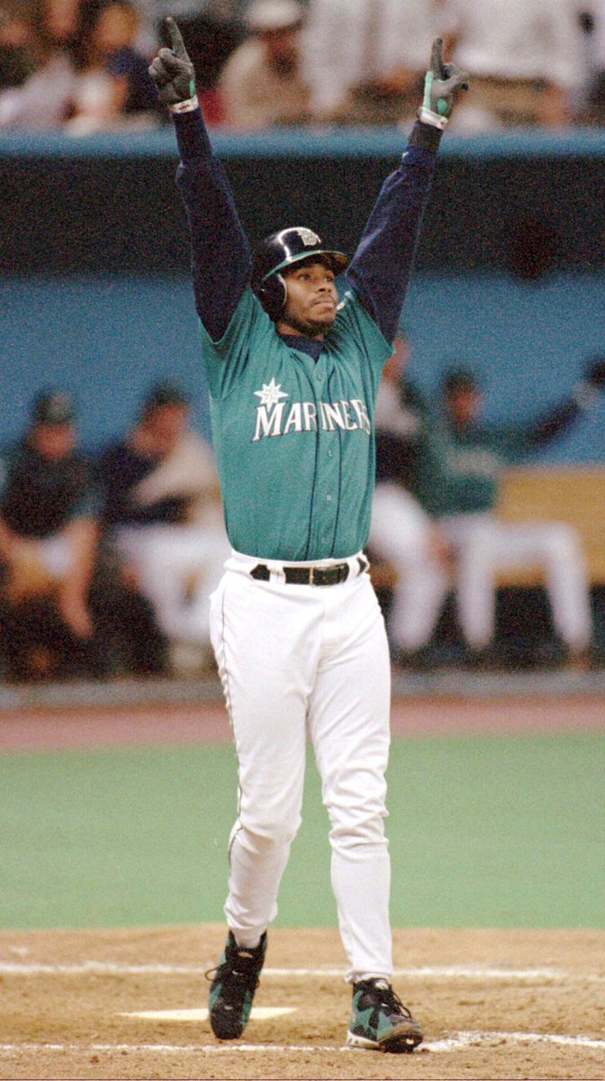 |
|
Vampiro138
Hank Scorpio
the greatest vampire in the HISTORY of our sport
Posts: 5,846
|
Post by Vampiro138 on May 22, 2022 2:04:17 GMT -5
Carlos Zambrano was the only guy with the balls to say outloud that the solid blue tops were far superior to the pinstripe uniforms for the Cubs. Zambrano will always be one of my favorite pitchers and even more caus he usually always went with the solid blue tops. 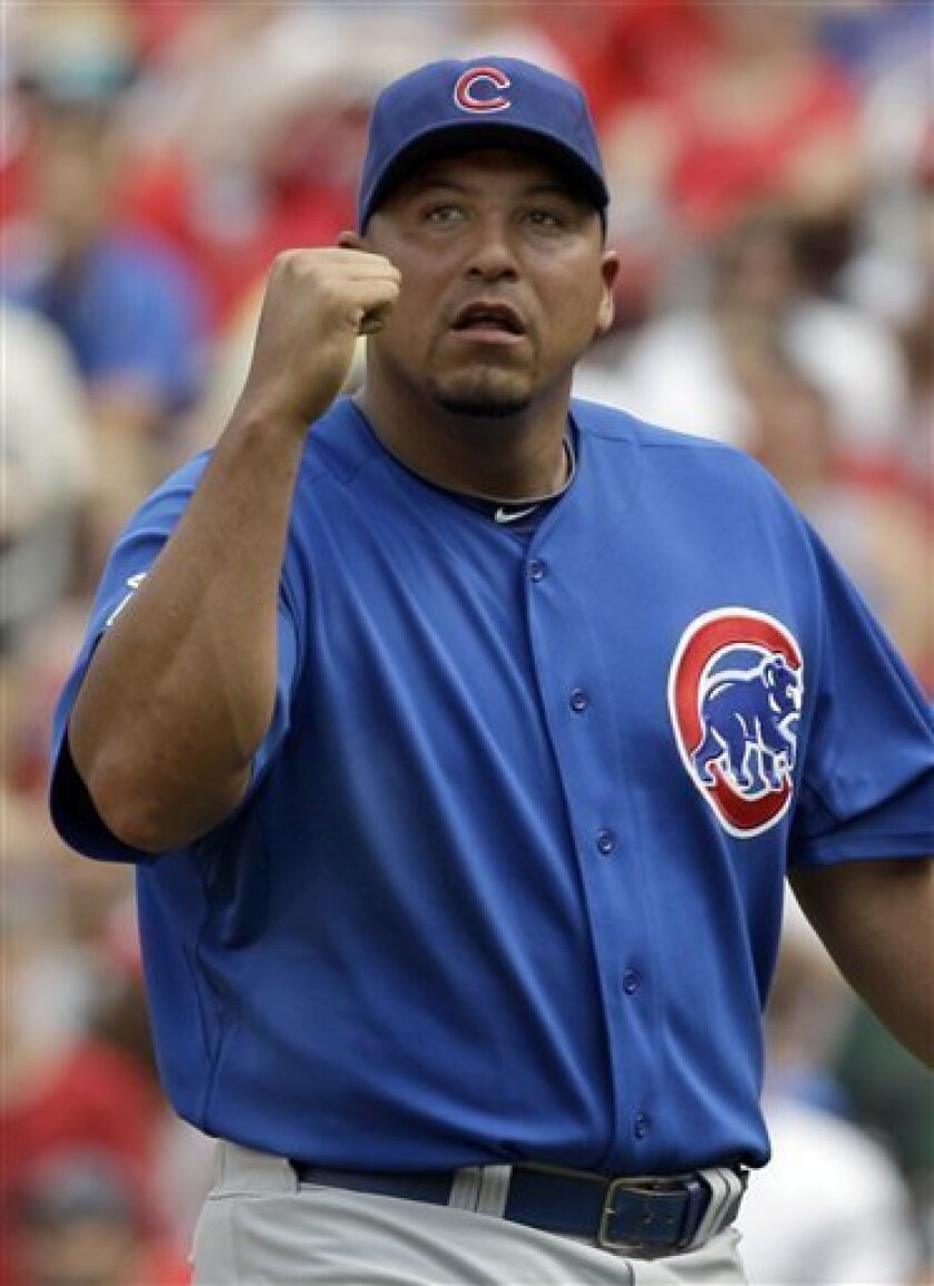 |
|
cjb01: Limited Edition Item!
FANatic
Writer, Lover of all things Wrestling. Analytical, Critical, Lovable (hopefully). Lets all have fun!
Posts: 247,895
|
Post by cjb01: Limited Edition Item! on May 22, 2022 2:21:21 GMT -5
The answer for me is ALWAYS the Phillies Powder Blues. Always 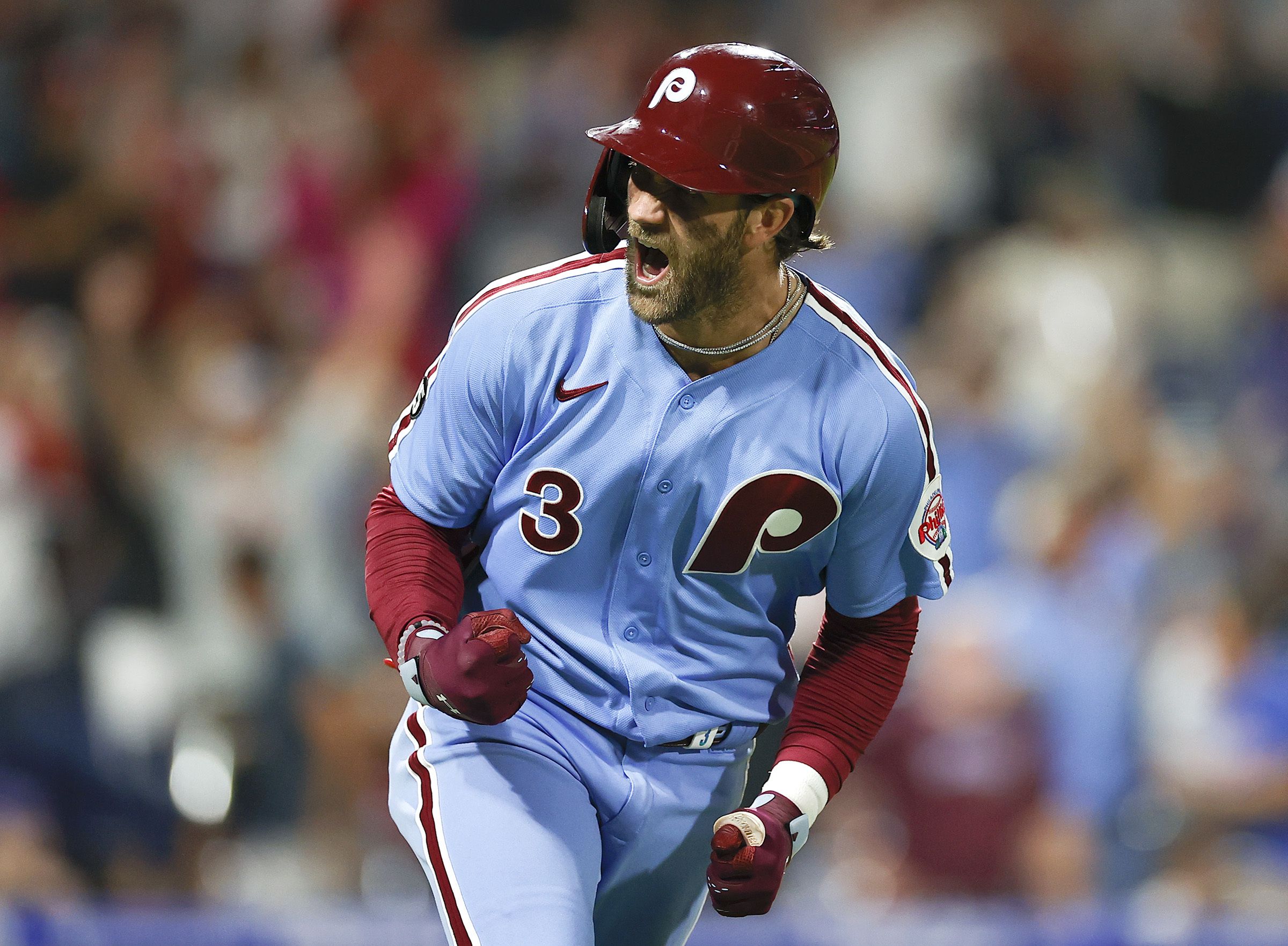 Though, special shoutout to the Kelly Green for the Eagles, which is making a comeback soon and I'm here for it.  |
|
|
|
Post by An Dog On An Skateboard on May 22, 2022 5:25:21 GMT -5
For the 2019 Cricket World Cup the England cricket team reverted to the light blue colour scheme they’d had in the nineties, and came out with a strip influenced by the famous 1992 World Cup ones.  Durham CCC’s 2021 one day kit was also a reproduction of their 1993 one, and I thought it was incredibly cool.  |
|