tafkaga
Samurai Cop
the Dogfather
Posts: 2,107
|
Post by tafkaga on May 15, 2022 17:10:07 GMT -5
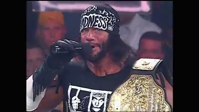
It's Spring of 1999, and Monday Nitro opens with this.  |
|
|
|
Post by RareTradU on May 15, 2022 17:14:24 GMT -5
I actually liked the WCW relaunch with the new logo. I understood why so many people didn’t like it but i was a fan. Still am btw, I have the logo as the wallpaper on my PC still.
|
|
tafkaga
Samurai Cop
the Dogfather
Posts: 2,107
|
Post by tafkaga on May 15, 2022 17:25:30 GMT -5
I actually liked the WCW relaunch with the new logo. I understood why so many people didn’t like it but i was a fan. Still am btw, I have the logo as the wallpaper on my PC still. I loved the logo but I wasn't a fan of the new Nitro set and how dark and drab everything looked. Initially though, I was excited because it felt like a new jumping on point. |
|
|
|
Post by Clash, Never a Meter Maid on May 15, 2022 17:33:48 GMT -5
Never liked it, I always found it too busy. Without the text underneath it’s too difficult for me to tell those are stylized W’s. I don’t mind the edges being blade like but were they not so squashed but still strongly designed, the whole thing would look much cleaner.
4/10 graphic design.
|
|
Deleted
Deleted Member
Posts: 0
|
Post by Deleted on May 15, 2022 17:34:37 GMT -5
Garbage.
I'll always associate some of the best years of wrestling with that diamond plate style logo. Not the NWO parts, but my god, was the under/mid-card of WCW on fire at that time
|
|
Johnny B. Decent
Patti Mayonnaise
Had one once
Everybody's Favorite Arizonian.
Posts: 31,073 
|
Post by Johnny B. Decent on May 15, 2022 17:40:53 GMT -5
It's hideous.
|
|
|
|
Post by Cyno on May 15, 2022 18:00:33 GMT -5
I liked the logo at the time but not so much the new nitro set.
Nowadays, though, I associate the logo with the garbage of WCW 1999 and 2000.
|
|
|
|
Post by chronocross on May 15, 2022 18:02:52 GMT -5
I hated it.
|
|
Mozenrath
FANatic
Foppery and Whim
Speedy Speed Boy
Posts: 121,068
|
Post by Mozenrath on May 15, 2022 18:04:35 GMT -5
I don't loathe it, but it is trying a bit too hard. It also always made me think of a squid beak biting through a wooden board.
|
|
|
|
Post by Lizuka #BLM on May 15, 2022 18:11:57 GMT -5
Always liked it and the accompanying Nitro set way more than the traditional ones.
|
|
ERON
Hank Scorpio
Posts: 6,778
|
Post by ERON on May 15, 2022 18:27:27 GMT -5
A good logo should be one that a kid could doodle on the cover of a notebook at school. This logo is not that. If I wasn't a wrestling fan, and someone stopped me on the street and asked me if I knew what the letters in the logo stood for, I'd say, "Those are supposed to be letters?"
|
|
|
|
Post by Dr. Bolty, Disaster Enby on May 15, 2022 18:33:13 GMT -5
Never liked it, still hate it, it just doesn't read to me at all. I can technically decipher the letters, but without being able to see them at a glance, it just looks like a generic logo that could be for anything.
|
|
|
|
Post by "Evil Brood" Jackson Vanik on May 15, 2022 18:35:32 GMT -5
It wasn't until very recently that I realized how it spelled W-C-W which in my mind makes it a bad logo.
|
|
bob
Salacious Crumb
The "other" Bob. FOC COURSE!
started the Madness Wars, Proudly the #1 Nana Hater on FAN
Posts: 78,356
|
Post by bob on May 15, 2022 18:41:34 GMT -5
Never liked it, I always found it too busy. Without the text underneath it’s too difficult for me to tell those are stylized W’s. I don’t mind the edges being blade like but were they not so squashed but still strongly designed, the whole thing would look much cleaner. 4/10 graphic design.  |
|
tafkaga
Samurai Cop
the Dogfather
Posts: 2,107
|
Post by tafkaga on May 15, 2022 21:14:28 GMT -5
I can only guess they superimposed the spaceship on the red logo just because they realized nobody know wtf they were looking at if they didn't have it spelled out.  |
|
|
|
Post by Hypnosis on May 15, 2022 21:17:56 GMT -5
I liked the logo at the time but not so much the new nitro set. Nowadays, though, I associate the logo with the garbage of WCW 1999 and 2000. Same. The logo just reminds me that WCW was never going to get back to its former glory. |
|
|
|
Post by XaviersSS2015hair on May 15, 2022 21:28:25 GMT -5
My initial reaction was something like "wtf is that?! What happened to the old set and how can they get it back?"
I stopped watching WCW in 98 due to every episode of Nitro ending the same for almost 2 years. And Hogan being on top forever. I'd occasionally check in on Nitro when I was bored and that is when I first saw this eyesore. I didn't know until years after WCW closed that the logo was supposed to read "WCW".
On Tony Schiavone's WHW podcast he has referred to it as "the exploding vagina logo." Which, if you really look at it, yeah. 🤣🤣🤣
|
|
Deleted
Deleted Member
Posts: 0
|
Post by Deleted on May 15, 2022 21:51:18 GMT -5
I knew the end was near.
|
|
CMWaters
Ozymandius
Rolled a Seven, Beat the Ads.
Bald and busy
Posts: 63,070
|
Post by CMWaters on May 15, 2022 21:54:16 GMT -5
Side question: JUST looking at what the logos look like and not what they represented storylines and such wise, how do you compare this to the spaceship logo?  |
|
Malcolm
Grimlock
Wanted something done about the color of his ring.
Eternally Confused
Posts: 13,481
|
Post by Malcolm on May 15, 2022 22:00:13 GMT -5
It don't even look like a "WCW".
It looks like a MESSING bird screaming "KILL ME! *SQWAUK*"
it's so bad that I legit forget that his logo exists. I even remember the one CMWaters is showing and I only remember that mostly in the tool assets of the video games.
|
|