|
|
Post by Hit Girl on May 15, 2022 22:17:08 GMT -5
Red Letter Media - "Whoaaaaaaaaaaah!"
|
|
wildojinx
Wade Wilson
Posts: 26,838
Member is Online
|
Post by wildojinx on May 15, 2022 23:24:23 GMT -5
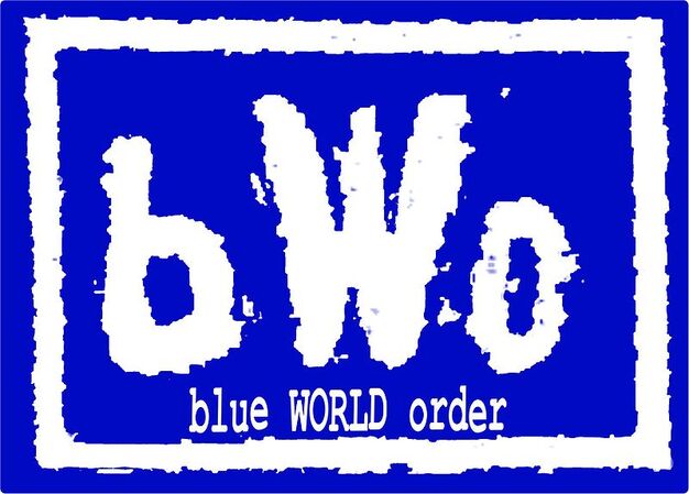
This is how WCW promoted the logo switch:  |
|
tirtefaa
Unicron
If you wanna know the truth, you gotta dig up Johnny Booth.
Posts: 2,829
|
Post by tirtefaa on May 15, 2022 23:25:50 GMT -5
I thought it was fine.
I preferred it to WWF's scratch logo.
|
|
El Pollo Guerrera
Grimlock
His name has chicken in it, and he is good at makin' .gifs, so that's cool.
Status: Runner
Posts: 14,718
|
Post by El Pollo Guerrera on May 16, 2022 0:00:23 GMT -5
Unreadable. If you want a logo to represent your company, you don't want the first reaction to be "what the hell is that supposed to be?" Took a few months before I saw a larger version of it where I could see there were letters in the logo, and not just the text inside the logo.
|
|
|
|
Post by S-Chrome on May 16, 2022 0:16:22 GMT -5
It looks like two hands prying open an anus... which pretty much was WCW in '99-2000.
|
|
|
|
Post by XaviersSS2015hair on May 16, 2022 0:31:39 GMT -5
It looks like two hands prying open an anus... which pretty much was WCW in '99-2000. 😂 |
|
|
|
Post by Vice honcho room temperature on May 16, 2022 7:48:29 GMT -5
"Look how they massacred my boy"
|
|
|
|
Post by Vice honcho room temperature on May 16, 2022 7:50:16 GMT -5
Side question: JUST looking at what the logos look like and not what they represented storylines and such wise, how do you compare this to the spaceship logo?  I mean its not amazing but at least you can tell what it is. |
|
|
|
Post by Milkman Norm on May 16, 2022 8:56:04 GMT -5
I thought it was dreadful.
|
|
tafkaga
Samurai Cop
the Dogfather
Posts: 2,107
|
Post by tafkaga on May 16, 2022 9:27:45 GMT -5
Side question: JUST looking at what the logos look like and not what they represented storylines and such wise, how do you compare this to the spaceship logo? Readable, so it's probably the 2nd best logo. I 50% resent the fact that they didn't just go back to the classic logo and I'm 50% relieved that the WWEWCW train wreck is not associated with the classic logo. |
|
The Enforcer
Trap-Jaw
Buster of Spines
Rejectin Your Reality
Posts: 384
|
Post by The Enforcer on May 16, 2022 17:58:32 GMT -5
It wasn't until very recently that I realized how it spelled W-C-W which in my mind makes it a bad logo. I'm glad I'm not the only one that didn't notice the logo spelled out WCW until years later. And yeah, when you can't recognize what the logo is supposed to be, your logo fails. Yes, the Invasion WCW logo felt lazy but at least you knew what the logo actually said. |
|
CMWaters
Ozymandius
Rolled a Seven, Beat the Ads.
Bald and busy
Posts: 63,068 
|
Post by CMWaters on May 16, 2022 18:03:20 GMT -5
It wasn't until very recently that I realized how it spelled W-C-W which in my mind makes it a bad logo. I'm glad I'm not the only one that didn't notice the logo spelled out WCW until years later. And yeah, when you can't recognize what the logo is supposed to be, your logo fails. Yes, the Invasion WCW logo felt lazy but at least you knew what the logo actually said. Nostalgia glasses off for a moment:  Can we really say the classic WCW logo is really that innovative? It's just the letters with slashed Ws. The ECW logo (once they went Extreme) at least had the barbed wire to emphasize their planned idea. Not saying the classic is bad, I do have a fondness for it (especially the ones from the old Nitro set) but at least WWF of the time actually made an actual logo. |
|
|
|
Post by The Dark Order Inferno on May 16, 2022 18:12:49 GMT -5
I didn't hate it, but the W#s needed to be a bit better defined. If you just saw the logo, you would need a minute to parse what it's going for, and it's not eyecatching enough to make average people put in that sort of effort, and that's terrible from a branding perspective.
|
|
|
|
Post by dablueboy on May 16, 2022 19:00:16 GMT -5
I can only guess they superimposed the spaceship on the red logo just because they realized nobody know wtf they were looking at if they didn't have it spelled out.  Ahh late era WCW Magazine, that and the brief ECW one were the hardest magazines to get hold of over here compared to both WWF magazines. Think WH Smiths was the only place I could get the WCW one, never realised it was so cheap either, the WWF ones were at least in the £3-3.50 price point iirc |
|
tafkaga
Samurai Cop
the Dogfather
Posts: 2,107
|
Post by tafkaga on May 16, 2022 20:45:49 GMT -5
I'm glad I'm not the only one that didn't notice the logo spelled out WCW until years later. And yeah, when you can't recognize what the logo is supposed to be, your logo fails. Yes, the Invasion WCW logo felt lazy but at least you knew what the logo actually said. Nostalgia glasses off for a moment: Can we really say the classic WCW logo is really that innovative? It's just the letters with slashed Ws. The ECW logo (once they went Extreme) at least had the barbed wire to emphasize their planned idea. Not saying the classic is bad, I do have a fondness for it (especially the ones from the old Nitro set) but at least WWF of the time actually made an actual logo. If we're rating innovating vs. readable, the old school WWF logo is better than the WCW space ship, but both WWF logos sacrifice readability for aesthetics if we're being fair. I introduced a friend to wrestling who asked me why the WWF logo was just 'WF'. The WWE logo is even worse because it's just two W's. The late 80's NWA logo is perhaps the worst of the lot in terms of readability.  So yeah it's not like the space ship is the first wrestling logo that you had to stare at for a sec to tell wtf it said. For me, the old WCW logo strikes the best balance between readability and being aesthetically pleasing. Honorable mention is the AWA logo. It's definitely a little busy and a product of its time but it pushes all my nostalgia buttons. |
|
Malcolm
Grimlock
Wanted something done about the color of his ring.
Eternally Confused
Posts: 13,481
|
Post by Malcolm on May 16, 2022 21:57:29 GMT -5
Nostalgia glasses off for a moment: Can we really say the classic WCW logo is really that innovative? It's just the letters with slashed Ws. The ECW logo (once they went Extreme) at least had the barbed wire to emphasize their planned idea. Not saying the classic is bad, I do have a fondness for it (especially the ones from the old Nitro set) but at least WWF of the time actually made an actual logo. If we're rating innovating vs. readable, the old school WWF logo is better than the WCW space ship, but both WWF logos sacrifice readability for aesthetics if we're being fair. I introduced a friend to wrestling who asked me why the WWF logo was just 'WF'. The WWE logo is even worse because it's just two W's. The late 80's NWA logo is perhaps the worst of the lot in terms of readability. So yeah it's not like the space ship is the first wrestling logo that you had to stare at for a sec to tell wtf it said. For me, the old WCW logo strikes the best balance between readability and being aesthetically pleasing. Honorable mention is the AWA logo. It's definitely a little busy and a product of its time but it pushes all my nostalgia buttons. I actually kinda like the NWA logo. Yeah, it's pretty unreadable but it also looks like a 1980s VHS opening logo which I love.
Personally, I think the only problem with the WCW logo is that they used a flat color. ECW had the barbed wire. WWF had chrome. The NWA logo above has gradient shading. WCW was just... blue.
|
|
PrimeTyme
Dennis Stamp
Be Good. Or Be Good At It
Posts: 4,914
|
Post by PrimeTyme on May 16, 2022 22:22:13 GMT -5
Hated it then and hate it now. Was always a fan of the big diamond plated WCW logo. I associate this logo with some of the worst times of WCW as well so that doesn’t help. Also, it was only a few years ago I found out that the design was WCW, I literally never knew that, I thought it was just some ugly space ship looking logo.
|
|
rrg251
Don Corleone
Posts: 2,045
|
Post by rrg251 on May 16, 2022 22:24:10 GMT -5
Funny how many interpretations we all have of the design, from spaceship to bird mess to "a squid beak biting through a board." Some can even kind of see the letters. Not unlike a Rorschach test.
But once you hear it compared to female anatomy, it's hard to see it as anything different.
|
|
tafkaga
Samurai Cop
the Dogfather
Posts: 2,107
|
Post by tafkaga on May 16, 2022 22:33:31 GMT -5
If we're rating innovating vs. readable, the old school WWF logo is better than the WCW space ship, but both WWF logos sacrifice readability for aesthetics if we're being fair. I introduced a friend to wrestling who asked me why the WWF logo was just 'WF'. The WWE logo is even worse because it's just two W's. The late 80's NWA logo is perhaps the worst of the lot in terms of readability. So yeah it's not like the space ship is the first wrestling logo that you had to stare at for a sec to tell wtf it said. For me, the old WCW logo strikes the best balance between readability and being aesthetically pleasing. Honorable mention is the AWA logo. It's definitely a little busy and a product of its time but it pushes all my nostalgia buttons. I actually kinda like the NWA logo. Yeah, it's pretty unreadable but it also looks like a 1980s VHS opening logo which I love.
Personally, I think the only problem with the WCW logo is that they used a flat color. ECW had the barbed wire. WWF had chrome. The NWA logo above has gradient shading. WCW was just... blue.
   |
|
|
|
Post by Oh Cry Me a Screwball on May 16, 2022 22:40:20 GMT -5
As someone who started watching wrestling as it was rolled out, I am surprised so many people never actually figured out it was the wCw letters.
|
|