|
|
Post by hellohumanoids on Dec 3, 2006 14:02:09 GMT -5
In 1999 WCW came up with this "monstrosity". It made the company look stupid, and devalue them, you had trouble understanding it at first, (what is it?) then later you finally think "Ahhhh". It wasn't what caused the inevitable downfall of WCW, but this was a joke, just like the organisation of the company behind closed doors. Look here and you will witness, this gruesome image WCW has bestowed upon us. Only words could express this horrifying vision, to accurately convey what it is. img.webring.com/r/w/wcw2/logoThis should be inducted to Wrestlecrap. Discuss. |
|
default
Bill S. Preston, Esq.
Blames Everything On Snitsky. Yes, Even THAT.
Posts: 17,056
|
Post by default on Dec 3, 2006 14:45:01 GMT -5
Funny story... apparently a bunch of Star Trek forumites got pissy because of that logo. Out of all their logos, I preferred the wide one they used, but it didn't last that long. In fact, I can only find one pic of it online and it's got that weird logo inside it... 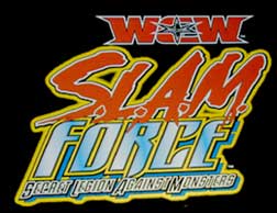 |
|
|
|
Post by GrantM on Dec 3, 2006 14:54:20 GMT -5
In 1999 WCW came up with this "monstrosity". It made the company look stupid, and devalue them, you had trouble understanding it at first, (what is it?) then later you finally think "Ahhhh". It wasn't what caused the inevitable downfall of WCW, but this was a joke, just like the organisation of the company behind closed doors. Look here and you will witness, this gruesome image WCW has bestowed upon us. Only words could express this horrifying vision, to accurately convey what it is. img.webring.com/r/w/wcw2/logoThis should be inducted to Wrestlecrap. Discuss. It's not loading |
|
|
|
Post by Bobafett on Dec 3, 2006 15:36:36 GMT -5
I dunno..I liked the entrance thing they had that was in its shape though, looked cool
|
|
|
|
Post by Austin's Middle Finger on Dec 3, 2006 16:54:14 GMT -5
How long did that one last? The red one was the logo they died with, right?
|
|
Reverend BTY
Hank Scorpio
Christian Troy: God's Gift
Posts: 7,206
|
Post by Reverend BTY on Dec 3, 2006 17:41:20 GMT -5
I liked the logo they had during the Invsaion. It was more than just block letters, but not all goofy star lookin.
|
|
|
|
Post by x on Dec 3, 2006 19:08:17 GMT -5
I always liked the one that looked like it said
V/CV/
|
|
|
|
Post by lildude8218 on Dec 3, 2006 19:54:05 GMT -5
I always thought that logo looked extremely obscene if you stared at it long enough
|
|
|
|
Post by hellohumanoids on Dec 3, 2006 19:59:59 GMT -5
The last WCW logo was much more respectable and i liked it. They should've never let the previous even make the final print. So is it wrestlecrap worthy?
The first time i saw this, i could not make out the WCW in that logo. Really bad design to me. The "C" is turned 90 degrees, and there looks like 2 "C"s opposite each other, so which one is the "C" thats the "C" in WCW, i've always guessed the top "C", and if it's the case that they are both "C"s, perhaps intending the bottom "C" is a reflection of the top "C", it could pass as WCCW, so the C's are very deceiving to the eye, if you see what i mean. All of this just to make a fancy pattern....sheesh!!
|
|
|
|
Post by Voldemar H. "Brak" Guerta on Dec 3, 2006 20:22:34 GMT -5
I dunno, I never really cared much about the "big logo change" they went through back then, still don't care much for it. Inducting it would a be a stretch, and a waste of Mr. Reynold's talent.
|
|
kevinhardy
Dennis Stamp
Because I can become a better Champion than this person.
Posts: 4,115
|
Post by kevinhardy on Dec 3, 2006 22:06:29 GMT -5
hmm wcw and star trek dont mix
|
|
|
|
Post by Joe Neglia on Dec 3, 2006 22:19:24 GMT -5
I dunno..I liked the entrance thing they had that was in its shape though, looked cool My favorite part of the raised logo they had on the entranc ramp was that after they put it there, the wrestlers started making bets on who would be the first to trip and fall because of it. A few people caught it and slightly stumbled, but it was a good while before someone outright tripped and fell because of it. And then a couple of months later, Chavo finally did just that, and whoever had their money on him cashed in. |
|
|
|
Post by texaswhopper on Dec 3, 2006 23:15:39 GMT -5
I think that Monday night when the NWO took over for the time someone tried to destroy the WCW logo near the ramp for unsuccessful long period of time. One of those NWO guys. I think that night is an induction in Wrestlecrap.
|
|
Phosphor Glow
Bill S. Preston, Esq.
Is a real girl!
Posts: 19,875 
|
Post by Phosphor Glow on Dec 4, 2006 2:46:28 GMT -5
I always kinda liked this logo. I didn't really like the one they went out on...it always looked fairly cheap to me.
V/CV/ will always be my favourite of their logos though.
|
|
|
|
Post by crunkenstein on Dec 4, 2006 3:51:24 GMT -5
The last WCW logo was much more respectable and i liked it. They should've never let the previous even make the final print. So is it wrestlecrap worthy? The first time i saw this, i could not make out the WCW in that logo. Really bad design to me. The "C" is turned 90 degrees, and there looks like 2 "C"s opposite each other, so which one is the "C" thats the "C" in WCW, i've always guessed the top "C", and if it's the case that they are both "C"s, perhaps intending the bottom "C" is a reflection of the top "C", it could pass as WCCW, so the C's are very deceiving to the eye, if you see what i mean. All of this just to make a fancy pattern....sheesh!! Actually, i think it's just one big C with the Ws and words going through it. I thought it looked alright, pretty nifty.  |
|
|
|
Post by Hassan bin Sober on Dec 4, 2006 8:32:34 GMT -5
Yeah I didn't like it much either. But I was also not a fan on the WWF's version of the WCW logo. They should of just went back to the old one.
|
|
Mitch 4:20
Don Corleone
The Cherry One
Posts: 2,062
|
Post by Mitch 4:20 on Dec 4, 2006 12:02:31 GMT -5
For us non WCW watchers of back in the day, can we a some side by side showing of the logos beginning to end as best as possible? I am curious exactly what people liked and hated.
|
|
|
|
Post by BlackJackRobby on Dec 4, 2006 17:06:39 GMT -5
It was just to much of a WWF copy, not the logo totally but the new colors and set design.
|
|
Phosphor Glow
Bill S. Preston, Esq.
Is a real girl!
Posts: 19,875
|
Post by Phosphor Glow on Dec 4, 2006 20:06:37 GMT -5
For us non WCW watchers of back in the day, can we a some side by side showing of the logos beginning to end as best as possible? I am curious exactly what people liked and hated.  First logo...my favourite.  Second logo...the one this thread was created for  Their last logo if I remember correctly. |
|
smokinvokoun
Dennis Stamp
Daffy's Gonna Kill You
Posts: 4,770
|
Post by smokinvokoun on Dec 4, 2006 20:13:42 GMT -5
I hate that logo. I actually can't tell WCW in that. And if I can, just barely
|
|


 hehehehe