|
|
Post by The Rick Jericho on Apr 24, 2022 10:26:53 GMT -5
|
|
|
|
Post by Aceorton on Apr 24, 2022 11:41:20 GMT -5
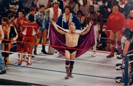
It's like Vince saw that one above and immediately was like, "No, no. Change of plans. Debbie, get Hogan on the phone." I loved this one for the color scheme and simplicity:  And this one just for the solid, balanced composition and readability:  For the most part, PWI covers (and all of the "independent" wrestling magazine covers outside WWF Magazine, really) were way too busy and used too many different colors. The text often got lost in all the clutter. The more basic ones were far more attractive. |
|