Deleted
Deleted Member
Posts: 0
|
Post by Deleted on Aug 22, 2016 5:38:40 GMT -5
I don't see what everyone is complaining about. It is exactly like the WWE title except red. It is annoying that it looks the same, but the reaction to it is baffling to me. It's a mix of the exactly the same thing, it being a fairly jarring shade of red, and the arena lights making it look like it's made out of meatloaf with the detailing done in mustard. |
|
|
|
Post by Alice Syndrome on Aug 22, 2016 5:39:18 GMT -5
I don't see what everyone is complaining about. It is exactly like the WWE title except red. It is annoying that it looks the same, but the reaction to it is baffling to me. That's the problem IMO, it looks like they just glued the regular belt onto a piece of red leather they had lying around. |
|
|
|
Post by Macho Pichu on Aug 22, 2016 5:52:04 GMT -5
I, for one, look forward to Finn's run as Eva Marie champion.
|
|
|
|
Post by Widow's Peak on Aug 22, 2016 6:37:33 GMT -5
Here's a photo of it, just in case you were looking through this thread for a photo of it and didn't want to go to WWE.com to find it. Because you missed Summerslam because you were watching a movie with your Nan instead; 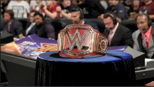 I thought it was an ugly title, but I just didn't appreciate how ugly it was until I saw the close-up. Wow that thing is hideous. |
|
Dub H
Crow T. Robot
Captain Pixel: the Game Master
I ❤ Aniki
Posts: 47,911
|
Post by Dub H on Aug 22, 2016 6:37:53 GMT -5
I don't see what everyone is complaining about. It is exactly like the WWE title except red. It is annoying that it looks the same, but the reaction to it is baffling to me. Thing is,the red strap makes it AWFUL.The contrast is really bad and the red leather just looks ugly in the belt. |
|
|
|
Post by Gerard Gerard on Aug 22, 2016 6:42:17 GMT -5
Here's a photo of it, just in case you were looking through this thread for a photo of it and didn't want to go to WWE.com to find it. Because you missed Summerslam because you were watching a movie with your Nan instead; I thought it was an ugly title, but I just didn't appreciate how ugly it was until I saw the close-up. Wow that thing is hideous. Otunga looks blurrily disgusted at it. |
|
|
|
Post by crowley1986 on Aug 22, 2016 6:46:44 GMT -5
Oh just bring back Big Gold instead
|
|
|
|
Post by Hot Noodle Truck on Aug 22, 2016 7:19:43 GMT -5
Wow. And here I thought people were just overreacting but no, that is a truly terrible looking championship. It looks like it's made of gummies. No, it doesn't look like that at all. Its just the other belt with a red background, what's the real problem with it I'm not seeing? Like others have said, the red just looks off and that ringside pic makes it look like a fruit roll up. I'm sure it'll grow on me, since I like their title design these days but at a first look, I'm not feeling it. |
|
|
|
Post by g1megatronfan on Aug 22, 2016 7:29:53 GMT -5
That's tackier than that piece of shit Cena title. I pity the poor bastard who has to wear that thing. Absolutely no creativity in WWE anymore from the talent all the way down to the titles they hold...it's a shame to see it come to this.
|
|
Dub H
Crow T. Robot
Captain Pixel: the Game Master
I ❤ Aniki
Posts: 47,911
|
Post by Dub H on Aug 22, 2016 7:41:20 GMT -5
Really the first thing wwe should do tonight, is announce they heard the feedback and are coming up with a new belt. But knowing WWE they are going to pipe in fake " the belt rocks" chants and how the belt is controversial
|
|
Hanzo
Dennis Stamp
"You want Cena to go to ECW?!"
Posts: 4,666
|
Post by Hanzo on Aug 22, 2016 7:52:55 GMT -5
I laughed when I read that after Balor won, the fans were cheering him and booing the title. That's great.
As for the belt itself, I get what they're trying to do: make it equal to the WHC by having a similar look and having a red strap because it's on Raw. But the thing is, none of that matters if they aren't treated equal. It's only been a month and to me, Smackdown already feels like the second rate show and having their number one title being defended in the middle of the PPV didn't help.
As for the belt itself, I would have liked to see something different. I like championship belts to look like championship belts and to me, they all look like toys and class rings, with the exception of the Intercontinental title.
|
|
Dub H
Crow T. Robot
Captain Pixel: the Game Master
I ❤ Aniki
Posts: 47,911
|
Post by Dub H on Aug 22, 2016 7:55:10 GMT -5
If anyone is curious , the video for the belt reveal has 5k likes and 10k dislikes
|
|
Deleted
Deleted Member
Posts: 0
|
Post by Deleted on Aug 22, 2016 9:17:23 GMT -5
I saw a tweet last night (retweeted by a guy I follow who just RT'd it 5 or 6 times to constantly mock it) saying that it was NOW available on WWEShop.com. .......and in my tired delirious state, I said aloud (to an empty apartment - forever alone) "You can just buy it on the website? So why are all these he-men fighting over it when my fat ass can buy it?" I a sleepy lad....  |
|
|
|
Post by lookout on Aug 22, 2016 9:31:27 GMT -5
If anyone is curious , the video for the belt reveal has 5k likes and 10k dislikes I think it's telling that even in actual news stories non wrestling news sites actually mentioned how bad the title looks..both to the fans and to the writers themselves. It's one thing for a section of fans to crap all over it but it's another when that criticism is even echoed by writers and people covering their product. As I noted in the other thread, it seemed to look a lot better on good morning america than it did last night but it won't change many opinions that it's a disappointment and a let down. I know the wwe likes to dismiss and ignore criticism but such widespread dislike for it actually hurts the title and that is not something they should want or be happy with. |
|
|
|
Post by General Adam on Aug 22, 2016 9:33:50 GMT -5
My thoughts about the design:
|
|
thecrusherwi
El Dandy
the Financially Responsible Man
Brawl For All
Posts: 7,660
|
Post by thecrusherwi on Aug 22, 2016 9:34:23 GMT -5
Three belts with the same design aside from color schemes just destroys any value they have. I think that's going way too far. The UFC and Boxing have titles at different weight classes that are literally identical. You cannot tell the difference between Conor McGregor's belt and Daniel Cormier's belt. It doesn't ruin the value at all. If anything, it is instantly recognizable as important because only the top talent have a belt that looks like that. I for one am not a huge fan of a title, but I also can't think of a scenario where there has ever been an overwhelmingly positive reaction to a new belt or trophy (I wasn't in the threads when they showed the CWC trophy so I don't know). But I get a sense that if Twitter was around in the 1960s, half the football fans would've gone "Two leagues, two networks, millions of dollars and all you could come up with is a silver football on a big stick!? The Super Bowl is never gonna take off. How could I take a World Football Champion seriously when they're holding that monstrosity!!?" |
|
|
|
Post by "Evil Brood" Jackson Vanik on Aug 22, 2016 9:36:33 GMT -5
I think the worst thing is it just looks poorly executed. The version of the title on their website looks bad but it looks polished. The one at Summerslam looked like a $50 replica version.
|
|
Deleted
Deleted Member
Posts: 0
|
Post by Deleted on Aug 22, 2016 9:42:49 GMT -5
I don't see what everyone is complaining about. It is exactly like the WWE title except red. It is annoying that it looks the same, but the reaction to it is baffling to me. It's a mix of the exactly the same thing, it being a fairly jarring shade of red, and the arena lights making it look like it's made out of meatloaf with the detailing done in mustard. I mean, I'm all for the belts having some sort of unity, but red on red is not a good look. I mean, if it's the Universal Championship, why not ham it up and have a starry backdrop on the main plate? Just give the belt something to make it different from the rest instead of it being a palette swap. |
|
Hawk Hart
Bill S. Preston, Esq.
Sold his organs.
The Best There Is, the Best There Was, and the Best That There Ever Will Be
Posts: 15,296
|
Post by Hawk Hart on Aug 22, 2016 10:30:52 GMT -5
It looks like a shitty Chaos Emerald.
|
|
|
|
Post by Toilet Paper Roll on Aug 22, 2016 10:38:44 GMT -5
The undisputed title from the early 2000s was so simple and great. Just black and gold, beautiful
|
|