|
|
Post by kropotkin on Dec 31, 2009 17:04:43 GMT -5
That logo is...just unfortunate looking. I really hope they spice that up a bit.
|
|
Mozenrath
FANatic
Foppery and Whim
Speedy Speed Boy
Posts: 121,125
Member is Online
|
Post by Mozenrath on Dec 31, 2009 17:42:24 GMT -5
Pfft, total newz. I designed their new logo.  I think it'll really make an iMPACT, amirite? But then......... RUSSO SWERVE!!!! 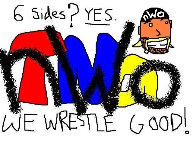 Awesome man. It was originally going to be Kurt, but it wasn't funny enough to me that way. I always seem to draw people pupiless. |
|
|
|
Post by hbk4ever09 on Dec 31, 2009 17:53:56 GMT -5
LOL at NWO.
|
|
|
|
Post by hajimenoippo on Dec 31, 2009 20:11:09 GMT -5
So they went from X to Z.
Z division?
|
|
|
|
Post by Michael Coello on Dec 31, 2009 20:16:27 GMT -5
So they went from X to Z. Z division? It's still an X.  |
|
Mozenrath
FANatic
Foppery and Whim
Speedy Speed Boy
Posts: 121,125
Member is Online
|
Post by Mozenrath on Dec 31, 2009 20:43:44 GMT -5
So they went from X to Z. Z division? Clearly someone is booking the division in their sleep. |
|
Celgress
Bill S. Preston, Esq.
The Superior One
Posts: 19,009
|
Post by Celgress on Dec 31, 2009 20:54:14 GMT -5
For Seven Years: "Six sides good, four sides bad." Seven Years Later: "Six sides good, four sides better."  |
|
|
|
Post by kennerado on Jan 1, 2010 7:03:25 GMT -5
My quick effort:  |
|
azz0r
Dennis Stamp
Ex 4 month ruling Wrestlecrap PPV Prediction Champion
Posts: 3,696
|
Post by azz0r on Jan 1, 2010 12:46:09 GMT -5
Just as an aside, TNA really screwed me over here. As someone who worked on the WWF art team circa Spring 2002, I put days of hard work into designing their new logo:  Last time I ever help them. I'm confused. How does you working on the WWE art team have anything todo with TNAs new logo? |
|
|
|
Post by ani on Jan 1, 2010 13:39:26 GMT -5
For Seven Years: "Six sides good, four sides bad." Seven Years Later: "Six sides good, four sides better." Who is the Mr. Jones of TNA then? |
|
Mozenrath
FANatic
Foppery and Whim
Speedy Speed Boy
Posts: 121,125
Member is Online
|
Post by Mozenrath on Jan 1, 2010 15:04:45 GMT -5
For Seven Years: "Six sides good, four sides bad." Seven Years Later: "Six sides good, four sides better." Who is the Mr. Jones of TNA then? I'm sure Nathan would show up if the money is right. |
|
Celgress
Bill S. Preston, Esq.
The Superior One
Posts: 19,009
|
Post by Celgress on Jan 1, 2010 15:40:55 GMT -5
For Seven Years: "Six sides good, four sides bad." Seven Years Later: "Six sides good, four sides better." Who is the Mr. Jones of TNA then? Ted Turner or the old WCW management generally speaking, in a round about sort of way of course. BTW Snowball = Jeff Jarrett Squealer = Dixie Napoleon = Hogan, brother! |
|
|
|
Post by GaTechGrad on Jan 1, 2010 18:46:29 GMT -5
I made another logo they can use:  |
|
|
|
Post by Apricots And A Pear Tree on Jan 1, 2010 19:06:48 GMT -5
I made another logo they can use: that......that....that....that is good.  |
|
|
|
Post by lildude8218 on Jan 2, 2010 19:21:00 GMT -5
I made another logo they can use: that......that....that....that is good. With the rumors of so many people coming in, I would say that Bandwidth Exceeded definitely works as a logo for them as well. |
|
|
|
Post by Lionheart on Jan 2, 2010 20:07:10 GMT -5
Just as an aside, TNA really screwed me over here. As someone who worked on the WWF art team circa Spring 2002, I put days of hard work into designing their new logo: Last time I ever help them. I'm confused. How does you working on the WWE art team have anything todo with TNAs new logo? OK, good, someone else doesn't get it either, I stared at his little cropped image for like two minutes trying to figure it out. |
|
|
|
Post by Michael Coello on Jan 2, 2010 20:10:14 GMT -5
I'm confused. How does you working on the WWE art team have anything todo with TNAs new logo? OK, good, someone else doesn't get it either, I stared at his little cropped image for like two minutes trying to figure it out. I'm guessing it's "Get the A Out" instead of the F from the logo change. |
|
Mozenrath
FANatic
Foppery and Whim
Speedy Speed Boy
Posts: 121,125
Member is Online
|
Post by Mozenrath on Jan 3, 2010 3:02:51 GMT -5
OK, good, someone else doesn't get it either, I stared at his little cropped image for like two minutes trying to figure it out. I'm guessing it's "Get the A Out" instead of the F from the logo change. And circle gets the square. |
|
SAJ Forth
Wade Wilson
Jamaican WCF Crazy!
Half Man-Half Amazing
Posts: 27,214
|
Post by SAJ Forth on Jan 4, 2010 16:55:35 GMT -5
While I would like storytelling to be more like it was 20 years ago, this story just makes me ask what did I just read?
I don't like the new logo.
|
|
Rick Mad
Grimlock
Rick Mad Champion
Posts: 14,613
|
Post by Rick Mad on Jan 4, 2010 18:05:51 GMT -5
I really thought the new logo in this thread was fake. But I guess not  |
|