wisdomwizard
King Koopa
Too Salty
Watching you.
Posts: 11,087 
|
Post by wisdomwizard on Jul 22, 2016 15:41:41 GMT -5
RAW's isn't bad, just different. Smackdown's is good though.
What I want to know is, is this a possible sign that RAW might finally be changing up its sets and stuff too like Smackdown?
|
|
Bang Bang Bart
Ozymandius
The King of North America
Posts: 60,905
Member is Online
|
Post by Bang Bang Bart on Jul 22, 2016 15:43:45 GMT -5
Maybe we get new themes on top of the new logos (and new graphics packages)?
|
|
wildojinx
Wade Wilson
Posts: 26,933
Member is Online
|
Post by wildojinx on Jul 22, 2016 15:47:26 GMT -5
Wait, Mickey Rourke played Randy the Ram,,we're finally getting that Jericho/Rourke match! |
|
|
|
Post by Mighty Attack Tribble on Jul 22, 2016 15:47:33 GMT -5
Between the new show logos and the uninspired 'trons of the last couple of years it's painfully obvious that the company have been saving money in the graphics department. Wouldn't surprise me if they just have a bunch of unpaid interns working down there.
|
|
|
|
Post by ben:friendship frog on Jul 22, 2016 15:47:44 GMT -5
It's about time. The RAW logo has been basically the same since 2008 and even that one was a quick upgrade from the one from 2002. Same with Smackdown, on the podium on RAW i'm sure they were using the exact logo from 2002.
These things never look too amazing in a picture, it's best to see how it is utilised with the opening graphics, lower thirds and other stuff. Even if it's still not great then i'll just be glad it's something DIFFERENT.
|
|
Deleted
Deleted Member
Posts: 0
|
Post by Deleted on Jul 22, 2016 15:48:41 GMT -5
SD's logo gets me more excited for the program compared to Raw's, I'll say that right now.
|
|
|
|
Post by Johawn on Jul 22, 2016 15:49:04 GMT -5
I don't mind Smackdown's. Raw's is brutal IMO.
I don't understand why, in this modern world of clean, simple, two colour logos, you'd have gradients and texture effects and all kinds of bullshit thrown in. They look so dated already. I'd honestly have kept the colour schemes they had on the t-shirts (white on red for Raw, white on blue for Smackdown) and just changed the fonts or whatever. Keep it simple.
|
|
|
|
Post by Rolent Tex on Jul 22, 2016 15:49:05 GMT -5
Smackdown Logo too 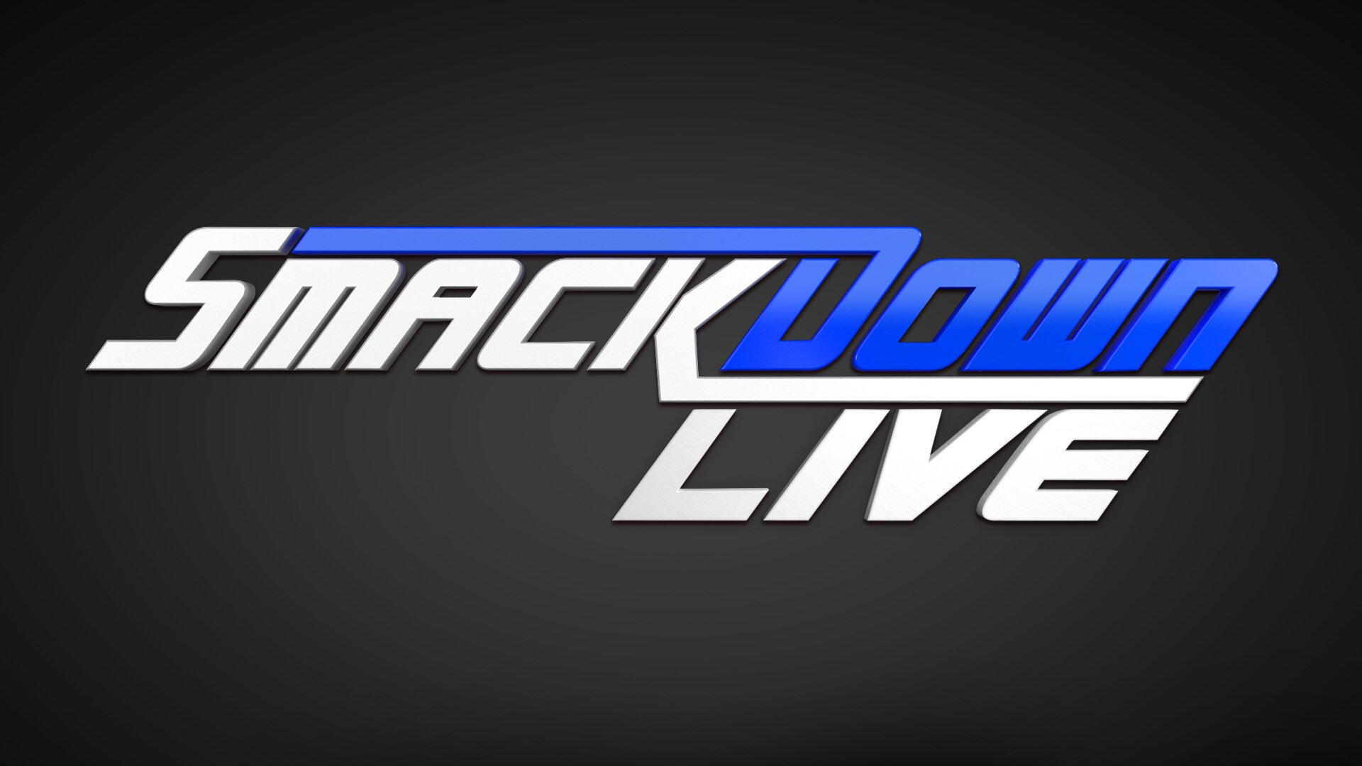 5 minutes in photoshop, baby Replace "Smackdown" with "Steiner" and we're talking a ratings goldmine baby! |
|
Deleted
Deleted Member
Posts: 0
|
Post by Deleted on Jul 22, 2016 15:53:02 GMT -5
Not a big fan of the Raw logo, but the Smackdown one is fine.
|
|
|
|
Post by YAKMAN is ICHIBAN on Jul 22, 2016 15:54:17 GMT -5
My problem with the Smackdown logo is that the color arrangement draws your eye from Smack, to Live, then to Down.
|
|
|
|
Post by "Gentleman" AJ Powell on Jul 22, 2016 15:55:01 GMT -5
SMH, it looks like a shonky parody logo you'd see in an MDickie game.
|
|
CH Punk
Bill S. Preston, Esq.
Advice: Noted
Stuck in the Retro Zone
Posts: 15,570
|
Post by CH Punk on Jul 22, 2016 15:58:44 GMT -5
With its gradient and other effects, the Raw logo looks like a play on the original Raw logo. For comparison: 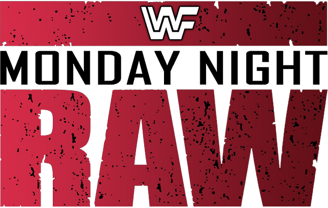 For Smackdown, while it does remind me slightly of the Impact logo, it's much cleaner and fits in much more with modern design aesthetic (Especially if they have a flat version as an alt). Also, wonder if the "Live" portion will mysteriously disappear when they do the bi-yearly show from England. |
|
|
|
Post by No Name is needed Bro Beans on Jul 22, 2016 16:01:30 GMT -5
It looks sexy
|
|
|
|
Post by Big Bad Kahuna on Jul 22, 2016 16:05:59 GMT -5
Not a big fan of the Raw logo, but the Smackdown one is fine. Same here. Looks like they put in 2 seconds of effort for the RAW logo |
|
Deleted
Deleted Member
Posts: 0
|
Post by Deleted on Jul 22, 2016 16:07:24 GMT -5
It's interesting that they went with a design for Raw that has a bit of dirt on it, there's not a single thing about their production now that's got an ounce of grit to it so it's not really a good match for the general feel of the show.
|
|
Deleted
Deleted Member
Posts: 0
|
Post by Deleted on Jul 22, 2016 16:08:29 GMT -5
Let's be honest...  Which looks like the better show? |
|
schizo
Dennis Stamp
Posts: 3,604
Member is Online
|
Post by schizo on Jul 22, 2016 16:09:40 GMT -5
My problem with the Smackdown logo is that the color arrangement draws your eye from Smack, to Live, then to Down. 'Ladies and gentalman welcome to SmackLive Down!" |
|
RIHT
Hank Scorpio
Wanted a title with "YOU'RE WELCOME!"
Close enough.
Hey-yo.
Posts: 5,897
|
Post by RIHT on Jul 22, 2016 16:11:30 GMT -5
If the Raw one looked a bit more like the original Raw logo, I think it'd be better. At least they did something new. The logo's been a variation of the same thing since 2002. Smackdown could be better, but keeps subtle nods to the classic 2003 Smackdown logo.
|
|
wankah
Don Corleone
Posts: 1,388
|
Post by wankah on Jul 22, 2016 16:12:35 GMT -5
Any chance they got a deal worked out with Dodge regarding that Raw logo?
|
|
Injustice45
Fry's dog Seymour
Consider me the Athena/Yoshimitsu of Avatars and Signatures.
Posts: 22,377
|
Post by Injustice45 on Jul 22, 2016 16:16:38 GMT -5
 (It's Mar's statue in Haven City). The SmackDown logo reminds me of Saturday Night's Main Event:  |
|