JoDaNa1281
Crow T. Robot
Jackie Daytona, Regular Human Bartender. #BLM
Posts: 40,936
|
Post by JoDaNa1281 on Jul 22, 2016 18:02:06 GMT -5
Let's be honest... 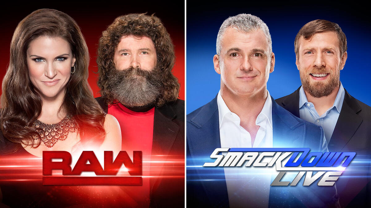 Which looks like the better show? Well, Smackdown doesn't have Stephanie, so that gives Smackdown an big advantage. |
|
FinalGwen
Bill S. Preston, Esq.
Particularly fond of muffins.
Posts: 16,457  Member is Online
|
Post by FinalGwen on Jul 22, 2016 18:02:17 GMT -5
When I first saw that Raw logo, I thought it was an amusing joke. Now it's just... Was someone genuinely paid for that?
|
|
bb8me
Mike the Goon
Posts: 32 
|
Post by bb8me on Jul 22, 2016 18:03:46 GMT -5
Any chance they got a deal worked out with Dodge regarding that Raw logo? Nice try at a little joke there...but a deal would be hard to do since Dodge hasn't owned Ram Trucks in nearly 5 years... |
|
VersionOne
Team Rocket
Like a phoenix, Southpaw Shall Rise!
Posts: 893
|
Post by VersionOne on Jul 22, 2016 18:27:10 GMT -5
The Smackdown one is ok, could maybe do with being a little flatter but Raw just looks unfinished. How humble lil me thinks it should be.  |
|
Deleted
Deleted Member
Posts: 0
|
Post by Deleted on Jul 22, 2016 18:31:31 GMT -5
The newwwwwwww Raw logo!
Uncut!
Uncooked!
Un...inspiring.
(Looks like the old Eastern Championship Wrestling logo.)
|
|
Welfare Willis
Crow T. Robot
Pornomancer
555-BONE
FDIC Bonsured
Game Center CX Kacho on!
Posts: 44,259
|
Post by Welfare Willis on Jul 22, 2016 18:33:03 GMT -5
When you walk away You don't hear me say, "Please, oh baby, don't go." Simple and clean is the way that you're making me feel tonight It's hard to let it go |
|
Juice
El Dandy
Wrong? Oh he can tell ya about being wrong.
I'm the one who raised you from perdition.
Posts: 8,172
|
Post by Juice on Jul 22, 2016 18:39:03 GMT -5
I think on the bottom corner of a screen, in transparant gray that logo will look good.
|
|
FinalGwen
Bill S. Preston, Esq.
Particularly fond of muffins.
Posts: 16,457
Member is Online
|
Post by FinalGwen on Jul 22, 2016 18:48:27 GMT -5
I think I've realised what makes this look quite so amateurish, even beyond the upside-down 'M'.
Pillow shading.
Most graphic designers realise pretty early on that it doesn't look good. It's a cheap way of trying to add depth that just looks ugly, like there's no real definable light source.
|
|
|
|
Post by Hassan bin Sober on Jul 22, 2016 18:50:54 GMT -5
These logos look like knock off logos you'd see on the cover of a third party book about RAW and Smackdown but couldn't get the rights to the actual ones.
|
|
|
|
Post by Urfarkendarf on Jul 22, 2016 18:50:54 GMT -5
As long as Raw gets rid of the shit theme song they've used for the past few years, I dont care about the logo.
|
|
|
|
Post by Hassan bin Sober on Jul 22, 2016 18:52:23 GMT -5
RAW logo reminds me of this:  |
|
Welfare Willis
Crow T. Robot
Pornomancer
555-BONE
FDIC Bonsured
Game Center CX Kacho on!
Posts: 44,259
|
Post by Welfare Willis on Jul 22, 2016 18:59:44 GMT -5
MONDAY NIGHT RAW - New logo, same old crap.
|
|
|
|
Post by woowoowoox on Jul 22, 2016 19:00:19 GMT -5
If this design trend of getting "simpler" keeps going, people will be using Comic Sans to make their logos by 2020. SMH.
|
|
|
|
Post by Kevin Hamilton on Jul 22, 2016 19:02:52 GMT -5
It makes me want to put a thorn in my EYE!
|
|
|
|
Post by Kevin Hamilton on Jul 22, 2016 19:04:09 GMT -5
Let's be honest... Which looks like the better show? Shane and D Bry look like they want to help you sell some real estate. They could sell Lou Ferrigno's house ten times faster than Peter Klaven. |
|
|
|
Post by A Platypus Rave on Jul 22, 2016 19:04:28 GMT -5
If this design trend of getting "simpler" keeps going, people will be using Comic Sans to make their logos by 2020. SMH. sees no problem with this  |
|
|
|
Post by EoE: Well There's Your Problem on Jul 22, 2016 19:05:04 GMT -5
If this design trend of getting "simpler" keeps going, people will be using Comic Sans to make their logos by 2020. SMH. Truly, Rudy Gobert Fadeaway is a trendsetter. |
|
|
|
Post by dreidemy on Jul 22, 2016 19:15:07 GMT -5
|
|
|
|
Post by DZ: WF Legacy on Jul 22, 2016 19:15:13 GMT -5
It looks like they took the Dodge Ram logo and reversed the M into a W. Pop an underline under that sucka and BAM, new Raw logo.
|
|
Bang Bang Bart
Ozymandius
The King of North America
Posts: 60,905
Member is Online
|
Post by Bang Bang Bart on Jul 22, 2016 19:17:34 GMT -5
The more and more I look at the "W" in Raw, the more I think it looks Soviet/Russian.
|
|