魔界5号
Hank Scorpio
No. 1 FAN Poster You Want To Hug
Posts: 6,331 
|
Post by 魔界5号 on Jul 22, 2016 16:17:57 GMT -5
What's with WWE going for such basic designs lately? Firs their website, then the Backlash logo, and now these.
|
|
Bang Bang Bart
Ozymandius
The King of North America
Posts: 60,904
Member is Online
|
Post by Bang Bang Bart on Jul 22, 2016 16:19:58 GMT -5
What's Smashup Wrestling doing in the SmackDown Zone?
|
|
|
|
Post by Error on Jul 22, 2016 16:20:39 GMT -5
What's with WWE going for such basic designs lately? Firs their website, then the Backlash logo, and now these. Flat and basic is the current popular design style. |
|
Deleted
Deleted Member
Posts: 0
|
Post by Deleted on Jul 22, 2016 16:20:46 GMT -5
It's about f***ing time.
|
|
pegasuswarrior
El Dandy
Three Time FAN Idol Champion
@PulpPictionary
Posts: 8,748
|
Post by pegasuswarrior on Jul 22, 2016 16:28:09 GMT -5
oof, gradients are so 1999. why not throw some explosion.gifs in there while you're at it. LOLWWE (And also this post. Except one is Juvenalian laughter while the other is respect laughter.) |
|
|
|
Post by edgestar on Jul 22, 2016 16:39:00 GMT -5
Let's be honest... 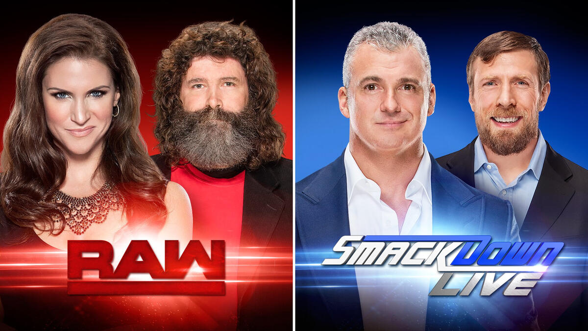 Which looks like the better show? Stephanie McMahon and younger Santa Claus, star in "Raw", while Shane McMahon, and J. Edgar Hoover, star in "Smackdown Live" this winter on the Hallmark Channel |
|
|
|
Post by Giul T. on Jul 22, 2016 16:41:16 GMT -5
Let's be honest... Which looks like the better show? well from those pics, Raw and SDL look to be the next two great sitcoms with Foley being the funny straight man to all of Stepahnies wild gossiping and planning, all while maintaining his dysfunctional family. While Shane and Daniel look to be two best friends trying to make it big with their next big get-rich-quick scheme. Daniel's the more approachable of course, but he gets drawn in by Shane's dare-devil-may-cry attitudes towards winning over potential customers |
|
|
|
Post by Gremlin on Jul 22, 2016 16:56:57 GMT -5
I like both new logos. Although until the content improves, I'm afraid it's all lipstick on a pig.
|
|
Deleted
Deleted Member
Posts: 0
|
Post by Deleted on Jul 22, 2016 17:04:38 GMT -5
I've said it before I'll say it again it needs more Haettenschweiler.
|
|
Deleted
Deleted Member
Posts: 0
|
Post by Deleted on Jul 22, 2016 17:05:29 GMT -5
Let's be honest... Which looks like the better show? Holy crap, both McMahon siblings look like shady used-car salesmen about to spring the trap on their unknowing - yet happy - victims. |
|
|
|
Post by A Platypus Rave on Jul 22, 2016 17:08:24 GMT -5
the RAW Logo looks like a combination of pretty much all of them. 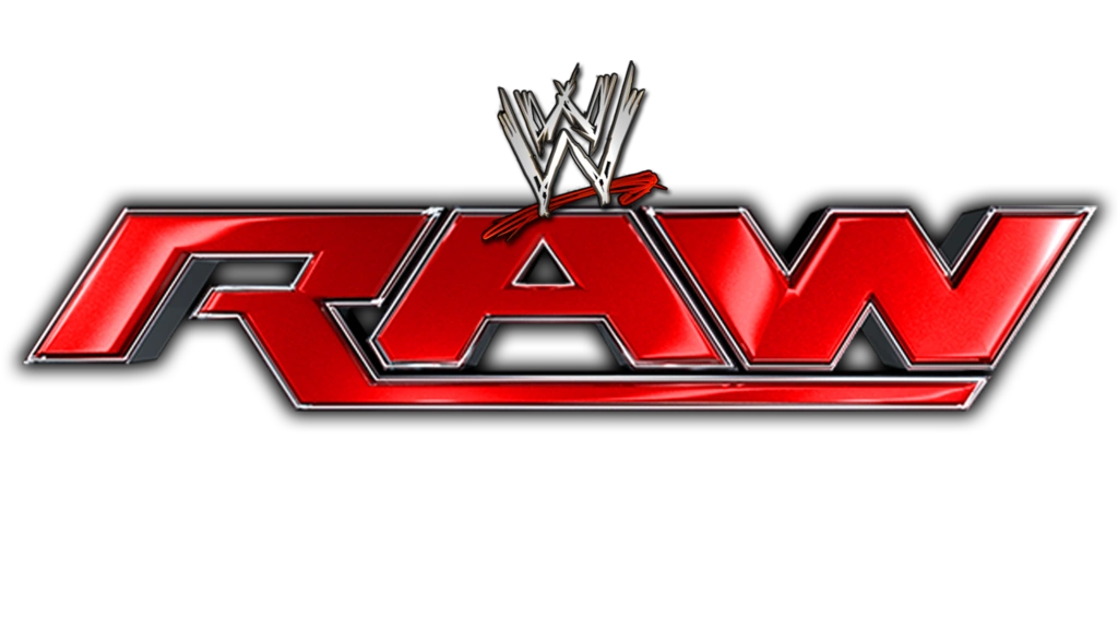 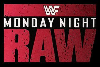 What's with WWE going for such basic designs lately? Firs their website, then the Backlash logo, and now these. Flat and basic is the current popular design style. Yep. "Basic" is the current IN thing for logos. Basically in response to the overly intricate logos a few years back. |
|
pegasuswarrior
El Dandy
Three Time FAN Idol Champion
@PulpPictionary
Posts: 8,748
|
Post by pegasuswarrior on Jul 22, 2016 17:11:51 GMT -5
I want someone to make a sign that says "RAM" for a show with flip-flop arrow symbols to the right of the "M"
|
|
Pushed to the Moon
Bill S. Preston, Esq.
Tony Schiavone in Disguise
Working myself into a shoot
Posts: 15,819
|
Post by Pushed to the Moon on Jul 22, 2016 17:12:17 GMT -5
I like it.
|
|
|
|
Post by EoE: Well There's Your Problem on Jul 22, 2016 17:13:16 GMT -5
They're all right, I guess. I'm not sure of what kind of new logo would look better, so I'm not going to worry about that.
|
|
|
|
Post by evilone on Jul 22, 2016 17:17:42 GMT -5
RAM is going to be one hell of a show
|
|
|
|
Post by Stone Cold Eleanor Shellstrop on Jul 22, 2016 17:21:52 GMT -5
Flat and basic has been my interest in WWE's product for nearly a year now.
|
|
Eunös ✈
Dalek
Duck Feet Expert
Tolerated, just not practically liked.
Posts: 59,227
|
Post by Eunös ✈ on Jul 22, 2016 17:23:14 GMT -5
It's not very good.
|
|
Venti
Unicron
Posts: 3,002
|
Post by Venti on Jul 22, 2016 17:28:32 GMT -5
I like it, but I've been wanting them to modernize the original 1993 logo. They've been updating the same slanted logo since 2002, going from looking gritty and raw(pun slightly intended), to obnoxiously sparkly, to just plain. So it's about time for a change.
|
|
|
|
Post by Confused Mark Wahlberg on Jul 22, 2016 17:29:50 GMT -5
Let's be honest... Which looks like the better show? Geez, could Mick not look like he's watching C-Span 2? |
|
thecrusherwi
El Dandy
the Financially Responsible Man
Brawl For All
Posts: 7,669
Member is Online
|
Post by thecrusherwi on Jul 22, 2016 17:57:19 GMT -5
Let's be honest... Which looks like the better show? That Foley pic is scary..  |
|