|
|
Post by Oh Cry Me a Screwball on Jul 23, 2016 3:53:54 GMT -5
If this design trend of getting "simpler" keeps going, people will be using Comic Sans to make their logos by 2020. SMH. Aren't there already some titantrons that use Comic Sans? |
|
|
|
Post by SeVeN: #TheBadGuy. on Jul 23, 2016 8:15:37 GMT -5
That W makes my brain hurt.
|
|
Chainsaw
T
A very BAD man.
It is what it is
Posts: 90,480
|
Post by Chainsaw on Jul 23, 2016 8:24:39 GMT -5
Smackdown Live logo makes me think of a direct-to-DVD science fiction movie from around 2003. TRANSMORPHERS LIVE |
|
|
|
Post by James Fabiano on Jul 23, 2016 8:27:42 GMT -5
NO ONE puts effort into logos anymore. As an expert on the subject (#closinglogogroup) I know.
|
|
Deleted
Deleted Member
Posts: 0
|
Post by Deleted on Jul 23, 2016 12:10:14 GMT -5
The texture gave off a compressed JPEG vibe to me, at first glance.  |
|
Oasis Asagi
Tommy Wiseau
Makai Wars for E3 '18
Posts: 58 
|
Post by Oasis Asagi on Jul 23, 2016 13:27:45 GMT -5
Huh...not to mention the color red being used...holy poop, they're dirty commies!! Don't tell him about the Extreme Rules logo looking like some sort of socialist work propaganda. (My 15 year old son pointed that out to me and I can't unsee it now.)  (Not even close.) |
|
Deleted
Deleted Member
Posts: 0
|
Post by Deleted on Jul 23, 2016 13:32:40 GMT -5
Don't tell him about the Extreme Rules logo looking like some sort of socialist work propaganda. (My 15 year old son pointed that out to me and I can't unsee it now.) (Not even close.) I'm not getting the connection. |
|
Vampiro138
Hank Scorpio
the greatest vampire in the HISTORY of our sport
Posts: 5,768
|
Post by Vampiro138 on Jul 23, 2016 22:29:48 GMT -5
so its the logo for RAM from Paul McCartney just with some small edits to it, and flipping over the M...  |
|
Flo360
Hank Scorpio
There is no truth in Wrestling...only Backbumps
Posts: 6,300
|
Post by Flo360 on Jul 24, 2016 9:54:41 GMT -5
Let's be honest... 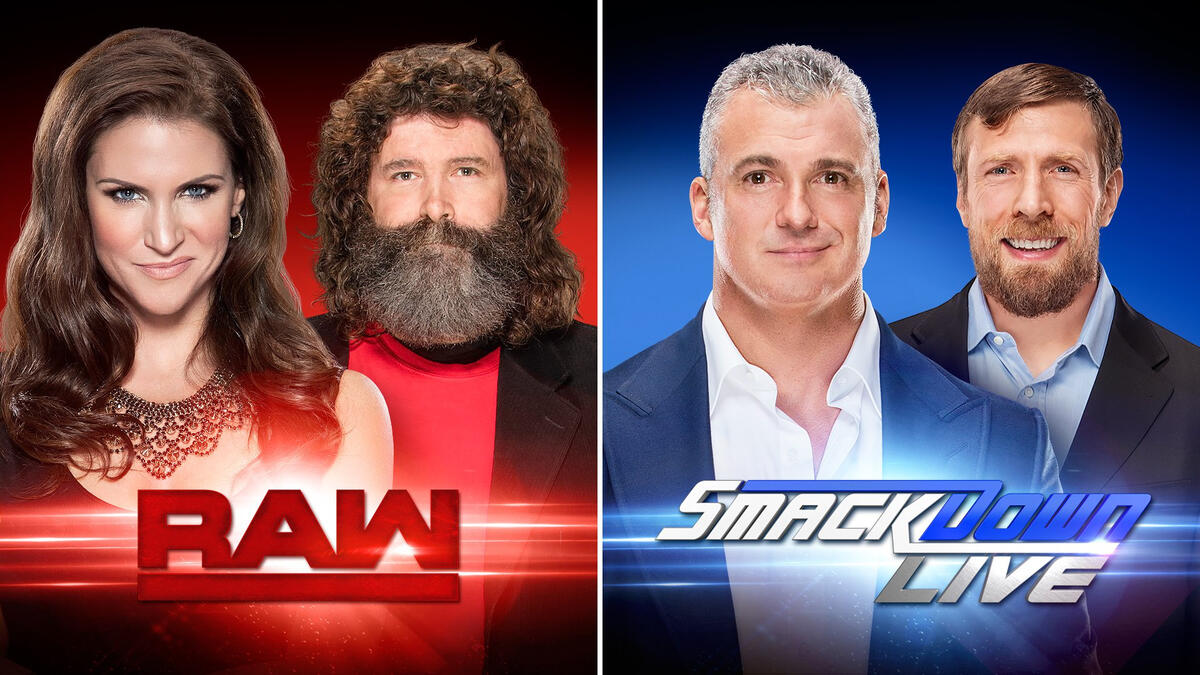 Which looks like the better show? Stephs Face makes me not want to watch. Damn Women, just smile for once. |
|
|
|
Post by TOK Hehe'd Around & Found Out on Jul 24, 2016 13:03:18 GMT -5
(Not even close.) I'm not getting the connection. 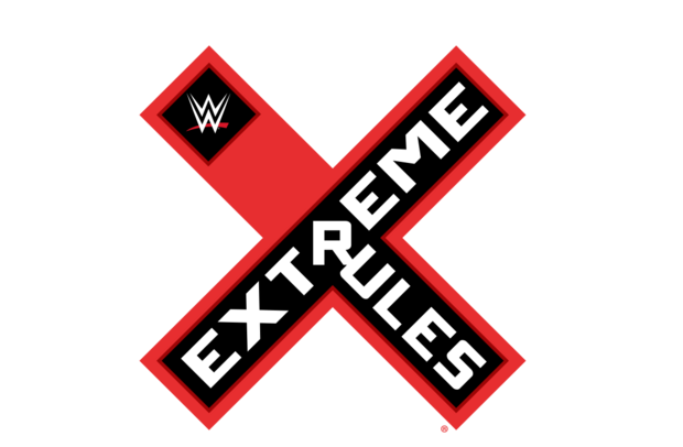 |
|
|
|
Post by Brother Nero....Wolfe on Jul 24, 2016 13:05:16 GMT -5
Who set RAW to Wumbo?
|
|
|
|
Post by Mighty Attack Tribble on Jul 24, 2016 16:29:49 GMT -5
Stephs Face makes me not want to watch. Damn Women, just smile for once. You don't want her to do that...   |
|
|
|
Post by edgestar on Jul 24, 2016 16:55:26 GMT -5
(Not even close.) I'm not getting the connection. I thought that said Pancreas Wrestling Let's be honest... Which looks like the better show? Stephs Face makes me not want to watch. Damn Women, just smile for once. In that picture, she looks like a girl I used to work with. And Mick looks like he just dusted his house from top to bottom, with his face |
|
JCBaggee
Hank Scorpio
Writer, streamer. I used to write for CBR but then they fired everyone who cared about their writers
Posts: 6,788
|
Post by JCBaggee on Jul 24, 2016 17:35:06 GMT -5
It doesn't even look like Mick in that picture. They photoshopped him something fierce.
Not to mention it looks like they may have tried to elongate Bryan's neck to make him look a bit taller. sigh.
|
|
|
|
Post by MAD TITAN on Jul 24, 2016 18:10:01 GMT -5
So weird seeing Mick look so serious in a picture.
|
|
CH Punk
Bill S. Preston, Esq.
Advice: Noted
Stuck in the Retro Zone
Posts: 15,570
|
Post by CH Punk on Jul 24, 2016 21:43:50 GMT -5
Since WWE are still using the old logos at Battleground and for Smackdown and Raw's TV ads, did they get cold feet about the logos?
|
|
|
|
Post by ben:friendship frog on Jul 24, 2016 22:28:10 GMT -5
Since WWE are still using the old logos at Battleground and for Smackdown and Raw's TV ads, did they get cold feet about the logos? Nah they'll just wait til tomorrow and Tuesday to unveil the full graphics package. I'm happy with RAWs look,the latest one was way too busy and gave me a headache. I just hope we get new stages. |
|
|
|
Post by Oakster on Jul 25, 2016 14:16:58 GMT -5
I agree that the bar on the Raw logo needed to be on the top as it looks totally lost below the text. Stick a WWE logo in it and you get:  And one with "Monday Night":  Totally getting 1993-meets-2016 vibes now. |
|
|
|
Post by Mighty Attack Tribble on Jul 25, 2016 14:42:53 GMT -5
I agree that the bar on the Raw logo needed to be on the top as it looks totally lost below the text. Stick a WWE logo in it and you get: And one with "Monday Night": Totally getting 1993-meets-2016 vibes now. Both of those are massive improvements. |
|